10 Image Effects and When to Use Them
Learn how to use effects—like Blur, Tint, and Duotone—to make photos work for your layout. Move beyond basic adjustments to create better text contrast, brand consistency, and visual focus.
Tue Dec 30 2025 • 6 min read
A photo can look perfectly fine… and still be wrong for the page.
It happens all the time.
You drop an image into a hero section, and suddenly your headline feels like it’s arguing with the background. Or you build a grid of thumbnails, and every one of them looks like it came from a different universe.
That’s where effects are useful.
Not as decoration. As small, practical nudges that make an image behave.
One boundary before we start: this post is about effects, not adjustments.
If you’re still fixing exposure, color casts, or “why does this look dull?”, that’s adjustment territory (brightness/contrast, saturation, temperature…).
Effects are what you do after the image is already acceptable - when you want it to feel more intentional.
And yes: if the page is slow, none of this matters. Optimize first, then style.
A simple way to think about effects
Most effects do one of five jobs:
- Make room for words (text overlays, busy backgrounds)
- Make a set feel consistent (mixed sources, mixed lighting)
- Turn a photo into a graphic (thumbnails, promos, bold sections)
- Protect privacy (screenshots, real-world photos)
- Pull the eye (what should the viewer notice first?)
We’ll walk through those jobs using 10 effects:
Blur, Tint, Duotone, Grayscale, Sepia, Film Grain, Posterize, Halftone, Pixelate, Glow.
When the photo won’t let your text breathe
This is the most common problem on the web.
Not “my image is bad.”
It’s “my image is too loud.”
Blur Effect
Blur is the fastest way to stop a background from competing with a headline.
It’s also a great way to hide messy context when the subject is what matters.
Use blur for things like:
- hero backgrounds with text
- background panels behind cards
- screenshots where you want to highlight one area
Skip it when the image needs inspection (products, UI details, charts). Blur doesn’t simplify - it removes.
Tool: Blur Effect
Tint Effect
Tint is Blur’s calmer sibling.
Instead of removing detail, it places the entire image under the same “light.”
Tint is good when:
- You want a mood without destroying the photo.
- You need a more readable text over an image.
- Your gallery needs a consistent atmosphere.
If tint starts changing product colors or skin tones, you’ve gone too far.
Tool: Tint Effect
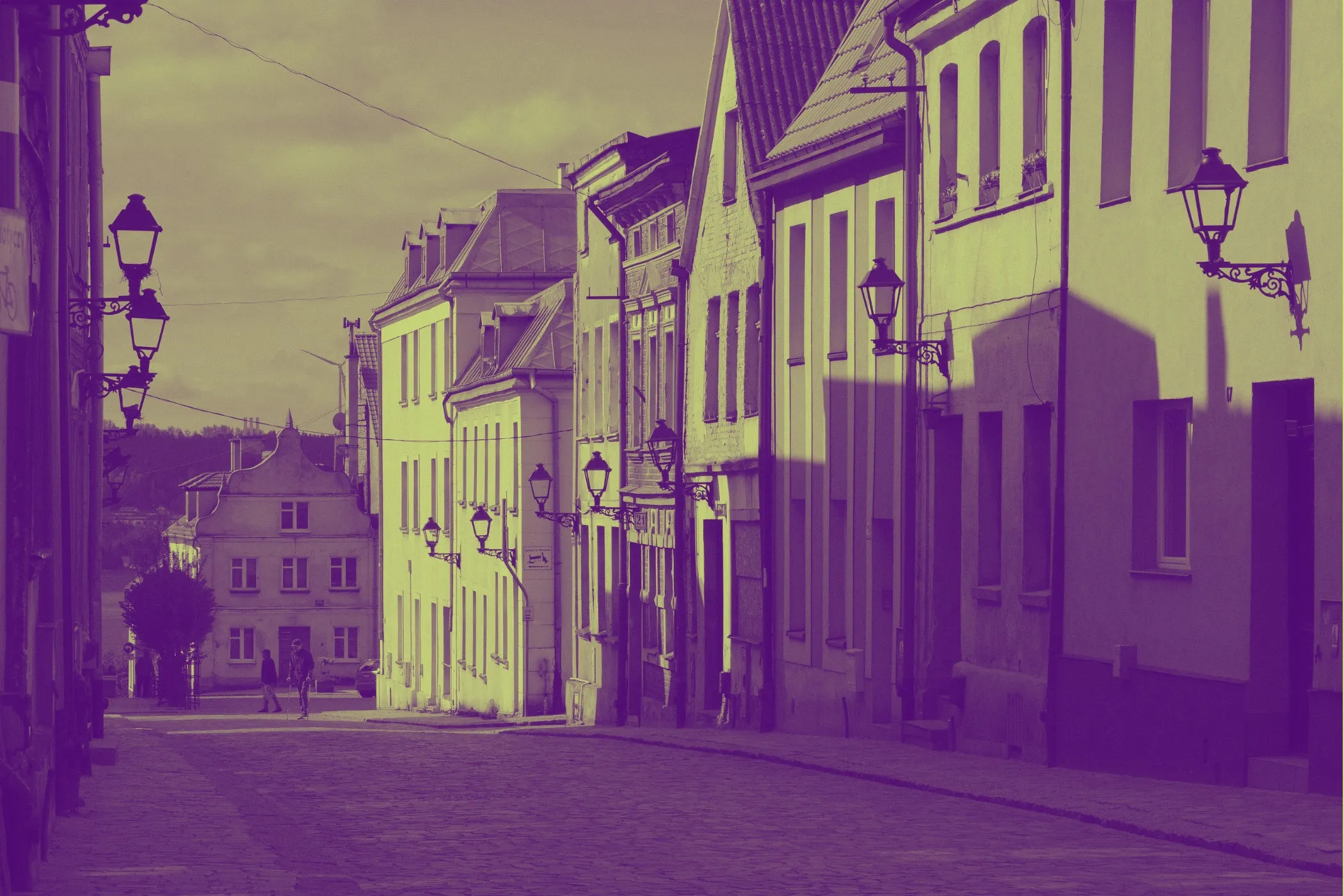
Duotone Effect
Duotone is what you reach for when you want the image to feel designed.
It’s bold. It’s opinionated. It turns “random photo” into “brand asset.”
Duotone works well for:
- landing page sections where realism isn’t required
- social graphics
- hero images where the silhouette matters more than the exact color
Don’t use it for anything where color accuracy matters most.
Tool: Duotone Effect
When your images don’t look like a set
You can have good photos and still end up with a messy page.
Different cameras. Different lighting. Different styles. The grid looks patchy.
These effects help you “meet in the middle.”
Grayscale Effect
Grayscale is a cleanup move.
It removes the color mismatch and lets the structure do the work.
This is especially handy for:
- case studies (UI screenshots + photos + diagrams)
- blog category thumbnails
- documentation pages
Avoid using grayscale when color conveys meaning (maps, status colors, safety labels).
Tool: Grayscale Effect
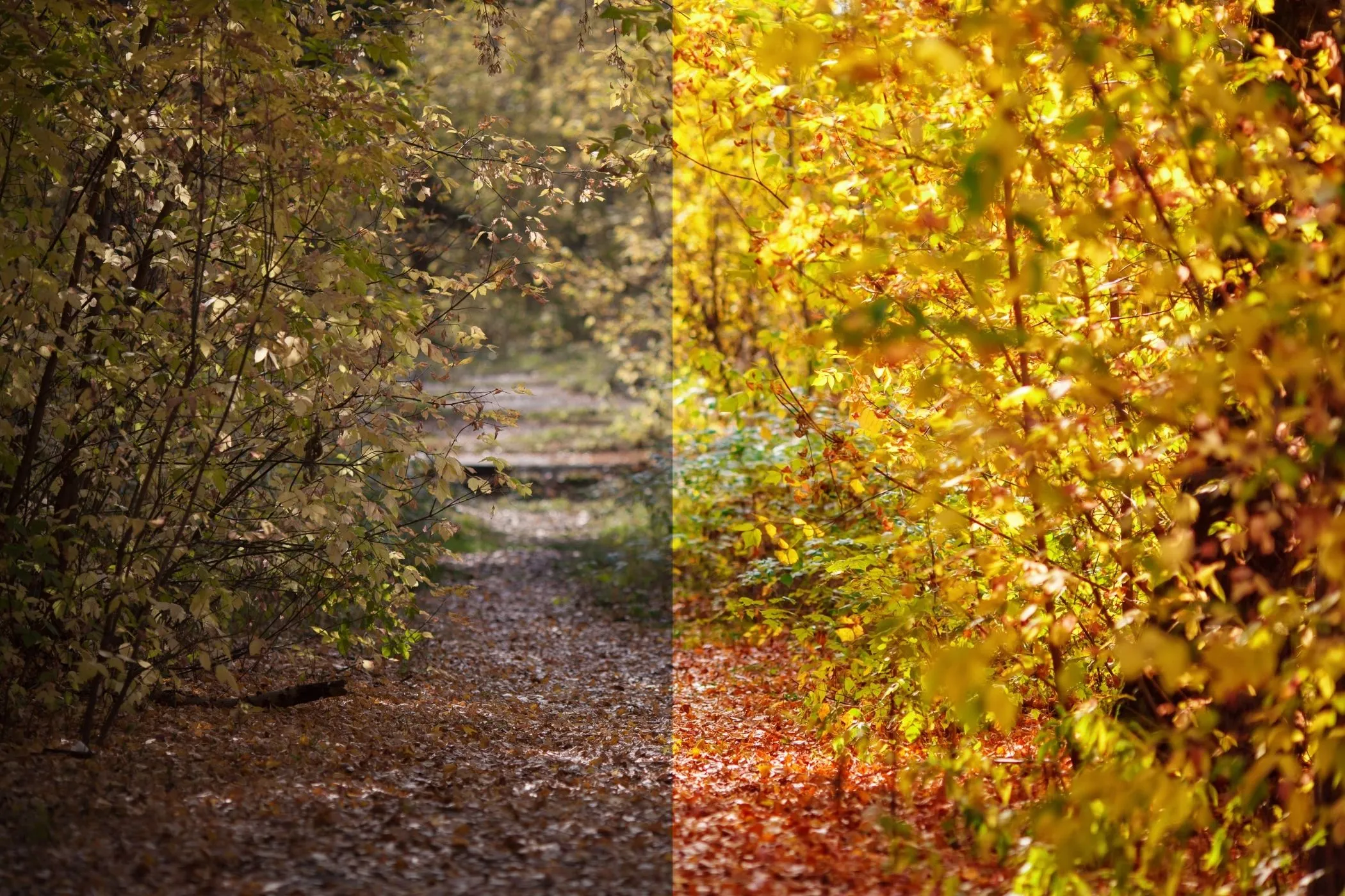
Sepia Effect
Sepia is a tone choice.
It conveys warmth, personal touch, and nostalgia.
It’s a great fit for:
- travel posts
- personal writing
- anything “archive-ish” where modern crispness feels wrong
If you use it everywhere, it feels like a costume.
Tool: Sepia Effect
Film Grain Effect
Grain is a subtle texture - the kind that makes digital photos feel less sterile.
It can also help a mixed set of images feel cohesive.
Use it when:
- The photos look too clean or overly processed.
- You’re mixing phone shots with camera shots.
- You want a slightly more “editorial” feel.
Avoid heavy grain on small images. It turns into mush fast.
Tool: Film Grain Effect
When you want a photo to behave like a graphic
Sometimes you don’t want a photo to look “real.”
You want fast reading, a bold look, and effective thumbnails.
Posterize Effect
Posterize collapses gradients into strong color bands.
That sounds destructive (it is), but it’s exactly what makes it useful.
Posterize is great for:
- thumbnails
- stylized portraits
- bold sections where realism isn’t the goal
It’s rough on skies, shadows, and skin tones. If faces start looking odd, they probably are.
Tool: Posterize Effect
Halftone Effect
Halftone is unapologetic.
It turns a photo into dots - print energy, screen-print vibes, poster territory.
Use it for:
- event promos
- album-style cover art
- loud landing headers
Avoid it when you need detail. Halftone trades detail for style.
Tool: Halftone Effect
When you’re publishing something, you shouldn’t show
This is the one effect that’s not about mood.
It’s about responsibility.
Pixelate Effect
Pixelation blocks information.
That makes it useful when the image as a whole shouldn’t be readable, but still needs to exist.
Pixelate works well for:
-
screenshots meant to show structure, not content
-
placeholder images where realism isn’t needed
-
previews where details shouldn’t be readable yet
strong “this is abstracted” visual signals One honest warning: pixelation can preserve the silhouette. If it’s truly sensitive, go bigger than you think.
Tool: Pixelate Effect
When you need the viewer’s eye to land somewhere
Sometimes the image is fine.
The problem is focus.
Glow Effect
Glow is emphasis without extra UI.
It can make a subject feel more present without adding an outline or a badge.
Glow works well for:
- a subject on a dark background (product silhouette, person, icon)
- subtle neon branding
- callouts where you want the eye to land first
Glow fails when everything glows. Then it’s just fog.
If you’re using Glow a lot, the detail that matters is the mask:
- Soft highlight mask feels more natural.
- Hard highlight mask feels more graphic (sometimes that’s the point)
Tool: Glow Effect
A quick “what should I use?” map
If you’re making a choice in 10 seconds:
- Need space for text → Blur or Tint.
- Need brand consistency fast → Duotone.
- Need a set to feel coherent → Grayscale or Film Grain.
- Need warmth / story tone → Sepia.
- Need bold, graphic thumbnails → Posterize or Halftone.
- Need privacy → Pixelate.
- Need the subject to stand out → Glow.
One last thing (the boring part that matters)
Effects are style.
Optimization is speed.
If your images are huge, the page will still feel slow - even if the look is perfect.
Resize and compress first, then come back and style.