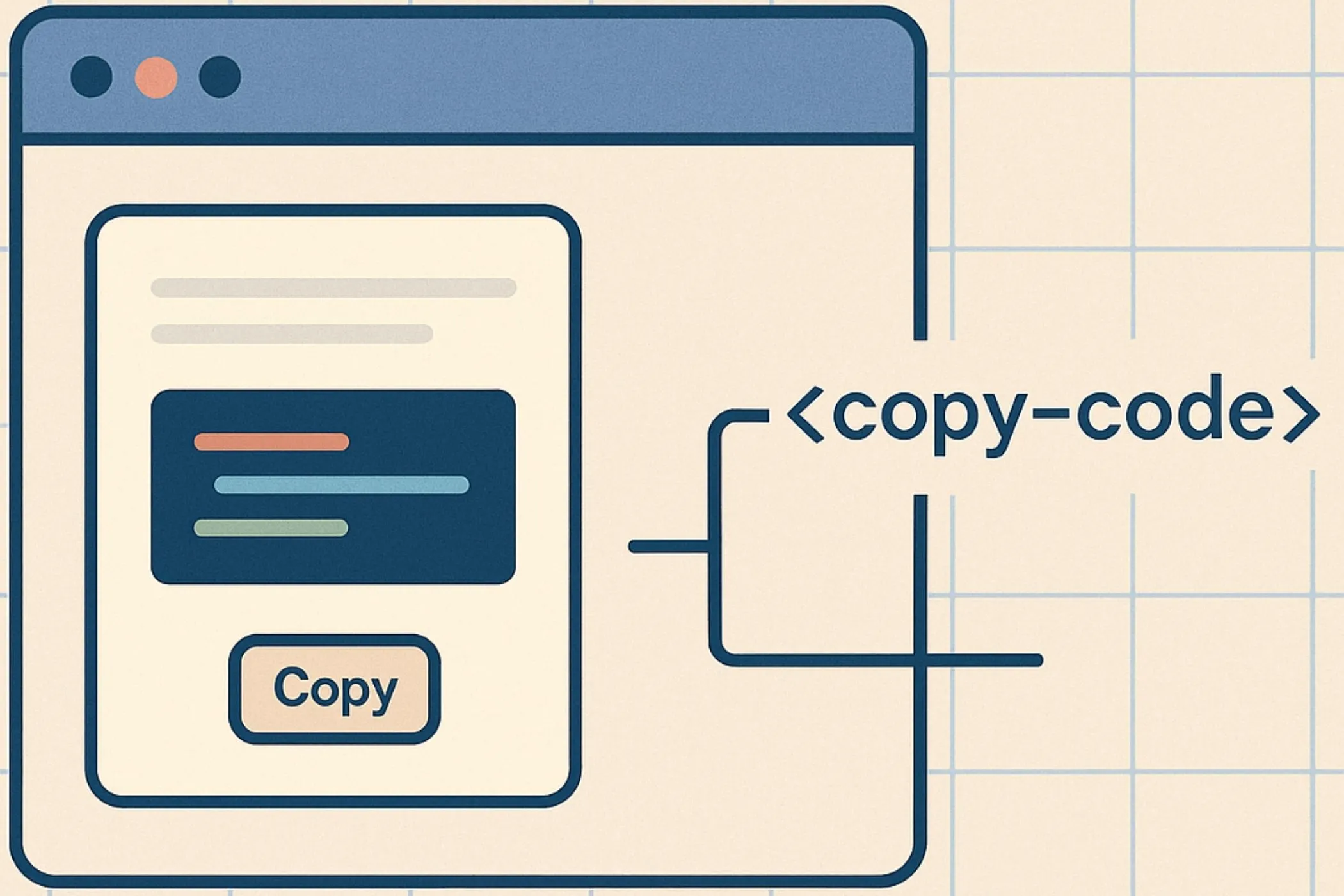
Pencil sketch, the right way (private, in-browser)
This tool turns a single image into a clean pencil sketch with controllable softness and a believable “graphite on paper” texture.
You get:
- Sketch Strength (how strong the effect is)
- Softness (smooth shading vs crisp lines)
- Detail (micro-contrast for crispness)
- Pencil (directional stroke texture)
- Grain (paper texture / natural noise)
- Paper tint (off-white, sepia, cool tones, etc.)
- Surprise me (varied styles that don’t feel repetitive)
No uploads. No accounts. Your image stays on your device.
Workflow & usage
-
Add an image Drag & drop, click to select, or paste (Ctrl/⌘ + V). EXIF orientation is respected.
-
Dial the sketch Start with:
- Strength → set how “sketchy” it should be
- Softness → decide soft pencil vs crisp ink-ish
-
Make it feel real Use Texture controls:
- Detail for crispness
- Pencil for visible strokes
- Grain for paper/noise realism
-
Choose paper Pick a paper color and adjust Tint amount.
-
Download Export at full resolution in the same format as the original file.
What is a sketch effect?
A sketch effect recreates the look of a pencil drawing by:
- converting the photo into tonal shading (like pencil pressure)
- smoothing and simplifying tones (so it doesn’t look like “photo noise”)
- adding subtle pencil strokes and paper grain
- keeping the output readable and clean
The goal is not “just edges” — it’s a believable pencil rendering.
Controls explained (practical)
Strength
- Lower Strength → more original photo remains (subtle sketch)
- Higher Strength → stronger pencil look (more stylized)
Tip: If your image gets too “washed out”, lower Strength a bit and raise Detail.
Softness
Softness controls how smooth the shading becomes.
- Higher Softness → softer pencil shading, cleaner gradients
- Lower Softness → crisp, sharp, more graphic
Tip: For portraits, softness usually looks better. For logos/graphics, keep it low.
Texture: Detail, Pencil, Grain
This is where the sketch stops looking digital.
- Detail: boosts micro-contrast (sharpness without “photo color”)
- Pencil: adds directional graphite strokes (the “drawing” feel)
- Grain: adds paper/noise texture (more natural output)
Fast recipe: Increase Pencil until the sketch feels “hand-made”, then add Grain to remove the last bit of digital smoothness.
Tone: Brightness & Contrast
- Increase Contrast if the sketch looks flat.
- Reduce Brightness if the image looks too pale.
Invert
Invert is for creative looks:
- negative sketches
- bright lines on dark paper
- poster-like styles
Paper tint
- Warm papers feel classic: off-white / cream / sepia
- Cool papers feel modern: blue-gray / light cyan
Quick recipes (copy these settings)
Use these as starting points, then adjust to taste.
Soft pencil (classic)
- Strength: 88–94
- Softness: 12–16
- Detail: 25–40
- Pencil: 35–55
- Grain: 18–35
- Paper: warm off-white, Tint 60–85
Clean portrait (crisp but natural)
- Strength: 90–96
- Softness: 9–13
- Detail: 40–60
- Pencil: 20–40
- Grain: 10–22
- Paper: off-white, Tint 45–70
Charcoal / gritty sketch
- Strength: 94–100
- Softness: 14–18
- Detail: 25–45
- Pencil: 55–85
- Grain: 30–55
- Paper: warm gray, Tint 25–55
Ink-ish / graphic lines
- Strength: 96–100
- Softness: 0–6
- Detail: 55–85
- Pencil: 0–25
- Grain: 0–15
- Paper: white, Tint 0–20
Sepia notebook
- Strength: 88–95
- Softness: 10–15
- Detail: 25–45
- Pencil: 30–55
- Grain: 25–45
- Paper: sepia, Tint 75–95
Tips for best results
-
Start with a good source image Strong lighting and clear shapes sketch best. Flat, low-contrast images can look dull.
-
Use Softness to “clean” noisy photos If your image is grainy, raise Softness a bit and rely on Grain (controlled) instead.
-
If it looks too smooth Increase Pencil and Grain, then add a little Detail.
-
If it looks too harsh Lower Detail and raise Softness slightly.
-
Export smart for the web After exporting, optimize with Image Compressor. For JPG workflows, consider Progressive JPEG Converter.
How it works
- Decode locally (browser image decoders + EXIF orientation).
- Convert to luminance (how bright each pixel is).
- Build the sketch base using a classic technique:
- invert + blur
- color dodge blending to create pencil-like shading
- Add micro-detail (to keep forms crisp).
- Add pencil strokes (directional texture) and paper grain for realism.
- Apply optional paper tint and export.
- Download uses the full original resolution (preview may be capped for speed).
Quality, privacy, and limitations
Privacy-first
Your image never leaves your device.
Transparency
- PNG/WebP transparency is preserved.
- JPEG has no transparency (so it can’t be preserved).
Limitations
- This is a raster effect (not a vector “SVG sketch”).
- Extremely noisy or ultra-low-contrast images may need Softness/Contrast adjustments.
Troubleshooting
-
“It looks washed out.” Lower Strength slightly, increase Detail, and raise Contrast a bit.
-
“It looks too digital / smooth.” Increase Pencil and Grain, then fine-tune Softness.
-
“It’s too noisy.” Increase Softness, reduce Grain, and lower Detail slightly.
-
“Lines are too harsh.” Lower Detail, increase Softness, or reduce Contrast.
-
“The result is too dark.” Increase Brightness a bit or reduce Contrast slightly.
Glossary
- Luminance (luma): perceived brightness computed from RGB.
- Color dodge: a blending method that brightens by dividing tones (classic sketch trick).
- Grain: controlled noise/paper texture to avoid a plastic digital look.
- Micro-contrast: small-scale contrast that creates crisp detail.