Oil Painting Effect in One Sentence
An oil painting effect turns a photo into painterly artwork by smoothing textures into soft brush-like regions, preserving important edges, enriching colors, and optionally adding subtle canvas texture.
Why an Oil Painting Effect Looks So Appealing
This style works because it makes ordinary photos feel more:
- artistic
- timeless
- expressive
- textured
- display-worthy
Instead of looking like a flat camera capture, the image starts to resemble a hand-worked painting with simplified detail, richer color masses, and a more intentional visual rhythm.
That makes it ideal when you want a photo to feel less literal and more like a finished piece of art.
What This Tool Does
This tool is built to give photos a painterly transformation without needing desktop editing software.
You can:
- Smooth fine photographic texture into brush-like painted regions
- Keep important edges more intact than a simple blur would
- Boost color richness for a more saturated oil-paint feel
- Add a subtle canvas weave texture for material realism
- Use Surprise me ✨ to jump between curated painting styles
- Export instantly in the same format as the original image
Everything happens locally in your browser, so it is private, fast, and easy to experiment with.
Workflow & Usage
1. Add an image
Drag & drop or click to select a JPEG, PNG, or WebP image.
This effect usually performs especially well on:
- landscapes
- still life photos
- portraits with clean lighting
- architecture
- travel photography
2. Set the brush character
Start with Brush Size (Detail).
This is the main painterly control:
- Lower values keep more detail
- Higher values create larger painted regions and stronger stylization
3. Increase the paint richness
Adjust Paint Vibrance to make colors feel more like richly applied pigment rather than flat photo color.
- Lower vibrance = subtle, natural painterly look
- Higher vibrance = bolder, more decorative, gallery-style color
4. Add surface character
Use Canvas Texture Opacity to introduce a woven material feel.
This can make the result feel more like:
- paint on linen
- canvas print artwork
- a finished physical painting rather than a digital filter
5. Try Surprise Me
Use Surprise me ✨ for quick stylistic jumps such as:
- thick impasto-style texture
- delicate watercolor-ish softness
- balanced classic painterly rendering
6. Download
Export instantly in the original format with a filename such as:
photo-oil.jpg
Understanding the Controls
Brush Size (Detail)
This is the most important control for the overall painting look.
It changes the radius of the painterly smoothing process, which affects how large the “painted” regions become.
What it does visually:
- Small brush sizes preserve more contours and fine image detail
- Medium brush sizes create a classic painted-photo look
- Large brush sizes simplify detail into broader, softer, more painterly masses
Practical ranges:
- 1–2 → light stylization, fine detail stays visible
- 3–4 → balanced painterly transformation
- 5–6 → strong oil-paint look with obvious brush-like smoothing
- 7–8 → bold, chunky, highly stylized artwork
Use smaller settings for portraits or detailed scenes, and larger settings for expressive landscapes or decorative art.
Paint Vibrance
This control boosts saturation before the painting effect is applied.
That matters because oil paintings often feel richer and more chromatic than the original photo.
What it does visually:
- makes colors feel fuller and more “paint loaded”
- increases visual separation between color areas
- helps landscapes, skies, flowers, and still life images feel more vivid
Practical ranges:
- 0–20 → subtle, restrained color
- 20–45 → natural painterly richness
- 45–70 → vibrant, decorative color
- 70–100 → bold, stylized, high-impact color
If the image starts feeling too artificial, reduce vibrance before lowering brush size.
Canvas Texture Opacity
This overlays a soft woven pattern across the result to mimic canvas fabric.
What it does visually:
- adds subtle material realism
- makes the image feel more like a printed or painted art piece
- introduces a handcrafted finish without overpowering the image
Practical ranges:
- 0 → clean digital painting look
- 5–20 → subtle canvas touch
- 20–40 → noticeable art-surface realism
- 40–60 → pronounced canvas presence
- 60–100 → heavily stylized texture layer
In most cases, moderate texture looks the most convincing.
Curated Looks You Can Create
The Surprise me ✨ button jumps between intentionally useful styles instead of fully random settings.
Thick Impasto
- Large Brush Size
- Higher Paint Vibrance
- Stronger Canvas Texture
Best for:
- expressive landscapes
- dramatic still life edits
- decorative poster art
Delicate Watercolor-ish
- Small Brush Size
- Low Paint Vibrance
- No canvas texture
Best for:
- softer portraits
- gentle travel scenes
- lighter, more delicate artistic edits
Classic Masterpiece
- Medium Brush Size
- Balanced Paint Vibrance
- Moderate Canvas Texture
Best for:
- all-purpose painterly results
- gallery-style artwork from photos
- balanced realism + artistic stylization
Best Settings (Copy These)
Use these as strong starting points.
Natural Painterly Photo
- Brush Size: 2–3
- Paint Vibrance: 15–35
- Canvas Texture Opacity: 0–15
Best for:
- portraits
- architectural images
- subtle artistic enhancement
Classic Oil Painting Look
- Brush Size: 3–5
- Paint Vibrance: 25–50
- Canvas Texture Opacity: 15–30
Best for:
- landscapes
- travel photos
- balanced painterly results
Rich Gallery Style
- Brush Size: 4–6
- Paint Vibrance: 45–70
- Canvas Texture Opacity: 20–40
Best for:
- wall-art mockups
- colorful scenery
- decorative prints
Thick Impasto / Bold Artwork
- Brush Size: 6–8
- Paint Vibrance: 50–75
- Canvas Texture Opacity: 35–60
Best for:
- expressive landscapes
- flowers and still life
- dramatic stylized pieces
Soft Fine-Art Portrait
- Brush Size: 2–4
- Paint Vibrance: 10–30
- Canvas Texture Opacity: 5–20
Best for:
- portraits with clean lighting
- elegant editorial images
- artistic profile shots
Best Images for an Oil Painting Effect
This effect looks best when the source image has:
- a clear subject
- readable shapes
- decent contrast between major forms
- enough light separation to define edges
The strongest image types are usually:
Landscapes
Trees, skies, mountains, coastlines, fields, and sunsets respond beautifully because the painterly smoothing turns natural textures into broad, expressive color regions.
Still Life
Flowers, fruit, food, ceramics, tablescapes, and decorative scenes often look naturally “paintable” because they already resemble traditional painting subjects.
Portraits with simple backgrounds
Portraits can work very well, especially with moderate brush size and careful vibrance settings.
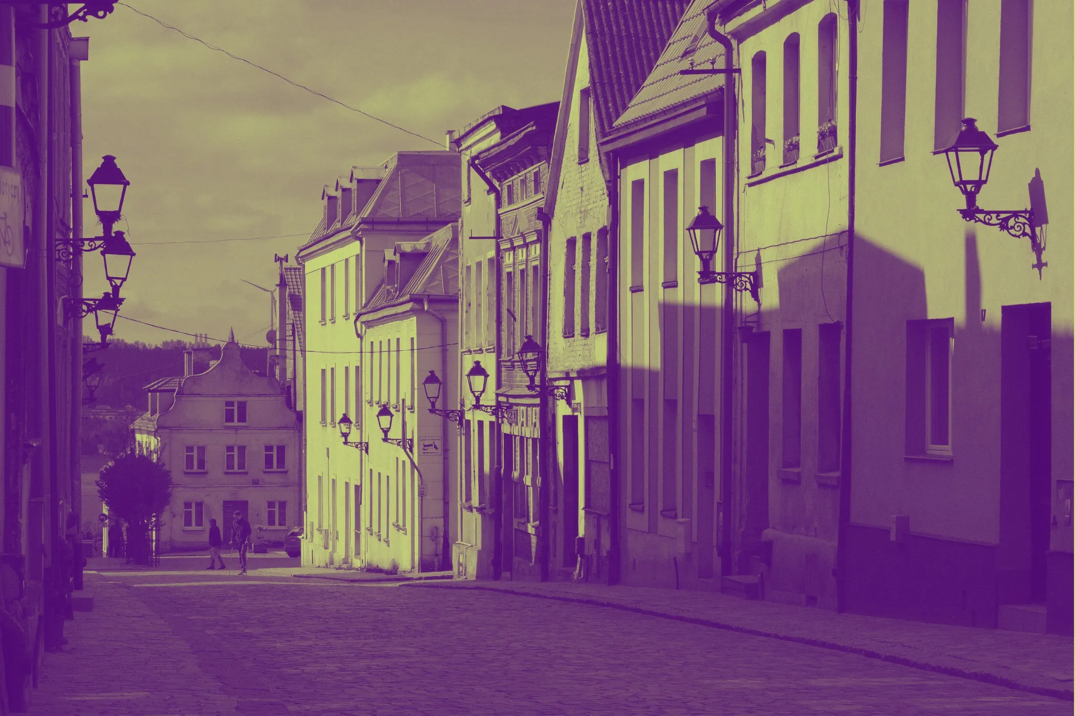
Architecture & travel scenes
Buildings, alleys, villages, and scenic streets gain a beautiful hand-painted postcard look.
Less ideal:
- very noisy or low-light photos
- heavily compressed images with visible artifacts
- overly busy scenes with too many tiny competing details
Perfect For
- Wall art mockups and print-style visuals
- Travel photography with a fine-art finish
- Portrait edits that feel softer and more timeless
- Still life artwork for decor or product storytelling
- Social media posts that need a more elegant, artistic aesthetic
- Creative gifts and custom photo-to-painting style edits
- Brand visuals where a handcrafted, premium feel matters
Tips for Better Results
Start with brush size first
Brush Size changes the character of the entire effect more than any other control.
A good order is:
- Set Brush Size
- Adjust Paint Vibrance
- Finish with Canvas Texture Opacity
Use moderate vibrance before maxing it out
Too much vibrance can make skin tones or subtle shadows feel unnatural.
It is usually better to find the right painterly structure first, then lift the color richness gently.
Match brush size to the subject
- Portraits usually benefit from smaller-to-medium brush sizes
- Landscapes can handle larger brush sizes well
- Still life often looks great with medium-to-large settings
Use texture as a finishing layer
Canvas texture should usually support the illusion, not dominate it.
A moderate setting often looks more premium than a very heavy one.
Common Problems
“It still looks too much like a photo.” Increase Brush Size first. That is the fastest way to make the image feel more painted.
“It looks too smudged.” Lower Brush Size. Large values can over-simplify fine features, especially in portraits.
“The colors feel too intense.” Reduce Paint Vibrance. Keep the painterly smoothing, but let the palette become more natural.
“It looks flat or digital.” Add a little Canvas Texture Opacity. Even a subtle woven texture can make the artwork feel more physical.
“The texture is too obvious.” Lower Canvas Texture Opacity and keep it in the subtle-to-medium range.
“Faces lost too much detail.” Use a smaller Brush Size and moderate Paint Vibrance. Portraits usually need more restraint than landscapes.
How It Works
This tool creates the oil-painting look in several stages, entirely in the browser.
- Your image is decoded locally.
- A working canvas is created for preview or export.
- Paint Vibrance boosts saturation before the painterly processing begins.
- An edge-preserving painting filter analyzes local regions and chooses the smoothest nearby color area for each pixel.
- That process simplifies fine texture while protecting stronger edges better than a normal blur.
- An optional canvas weave pattern is overlaid using blending for subtle material texture.
- The final artwork is rendered and exported instantly.
The result is a painterly transformation that feels smoother, richer, and more art-like than simple blur-based “paint” filters.
Why This Looks Better Than a Basic Blur Filter
A normal blur smears everything together equally.
That usually causes:
- muddy edges
- loss of structure
- flat, cheap-looking softness
This oil painting effect works differently because it favors locally smoother regions while preserving stronger boundaries more intelligently.
That means you get:
- softer painted textures
- cleaner shape separation
- better subject readability
- a result that feels more intentional and artistic
In practice, it looks much closer to a true painterly stylization than a generic blur ever could.
Design Notes
The best oil-paint effect is not just “stronger smoothing.” It is a balance between:
- preserving enough structure to keep the subject recognizable
- simplifying enough texture to feel painted
- enriching color without making it artificial
- adding material texture without overpowering the artwork
That balance is what makes this tool useful for both subtle fine-art edits and more dramatic decorative transformations.
If you want one reliable “looks good fast” starting point:
Brush Size 4 + Paint Vibrance 35–45 + Canvas Texture 15–25
That range usually creates a classic, attractive oil-painting result on a wide variety of images.