Resize images to 1600×900 (HD+)
The 1600×900 resolution sits between standard HD (1280×720) and Full HD (1920×1080). It uses a 16:9 widescreen format, making it a practical choice for modern screens where you want better clarity without the full weight of higher resolutions.
Resizing an image to 1600×900 helps you create visuals that feel sharp, balanced, and efficient, especially for laptop displays, dashboards, and web applications.
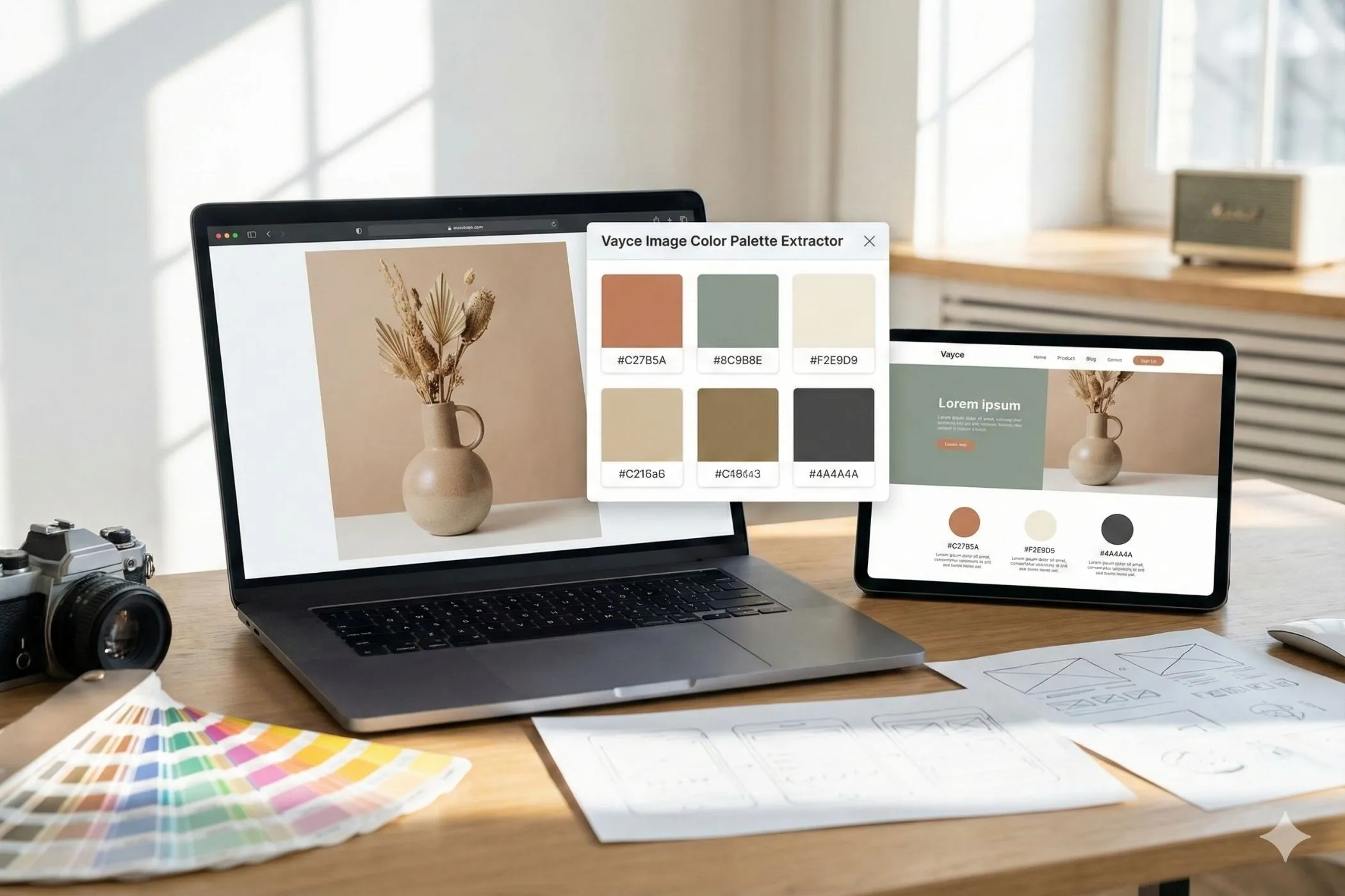
This tool allows you to resize images to exact 1600×900 dimensions while maintaining composition and visual quality.
Everything runs locally in your browser, so your images stay private and processing remains fast.
Why 1600×900 is a practical middle ground
Not every project needs Full HD assets. In many cases, 1920×1080 images are heavier than necessary, while 1280×720 may feel slightly soft on modern screens.
1600×900 provides a balanced alternative.
It is commonly used for:
- laptop wallpapers and backgrounds
- web dashboards and admin panels
- presentation visuals
- medium-resolution banners
- UI previews and mockups
Because it maintains the 16:9 ratio, it fits perfectly into widescreen layouts while reducing file size compared to Full HD.
What this 1600×900 resizer does
This tool resizes images into an exact 1600×900 frame using cover mode, ensuring the image fills the entire frame without distortion.
You can:
- Drag & drop images into the tool
- Paste images directly from your clipboard
- Automatically fit images into a 1600×900 canvas
- Preserve aspect ratio while filling the frame
- Resize multiple images at once
- Download individually or export as a ZIP
The preview updates instantly so you can confirm the composition before exporting.
How to resize an image to 1600×900
1. Upload your image
Add your image by dragging it into the tool, selecting it manually, or pasting it from your clipboard.
Supported formats:
- JPEG
- PNG
- WebP
2. Automatic cover resizing
The tool applies a cover fit automatically.
This means:
- the image fills the full 1600×900 frame
- aspect ratio is preserved
- edges may be cropped slightly to fit the frame
This is ideal for dashboards, layouts, and banners where full coverage is required.
3. Export your resized image
Download the resized image instantly or export multiple images together as a ZIP file.
Common uses for 1600×900 images
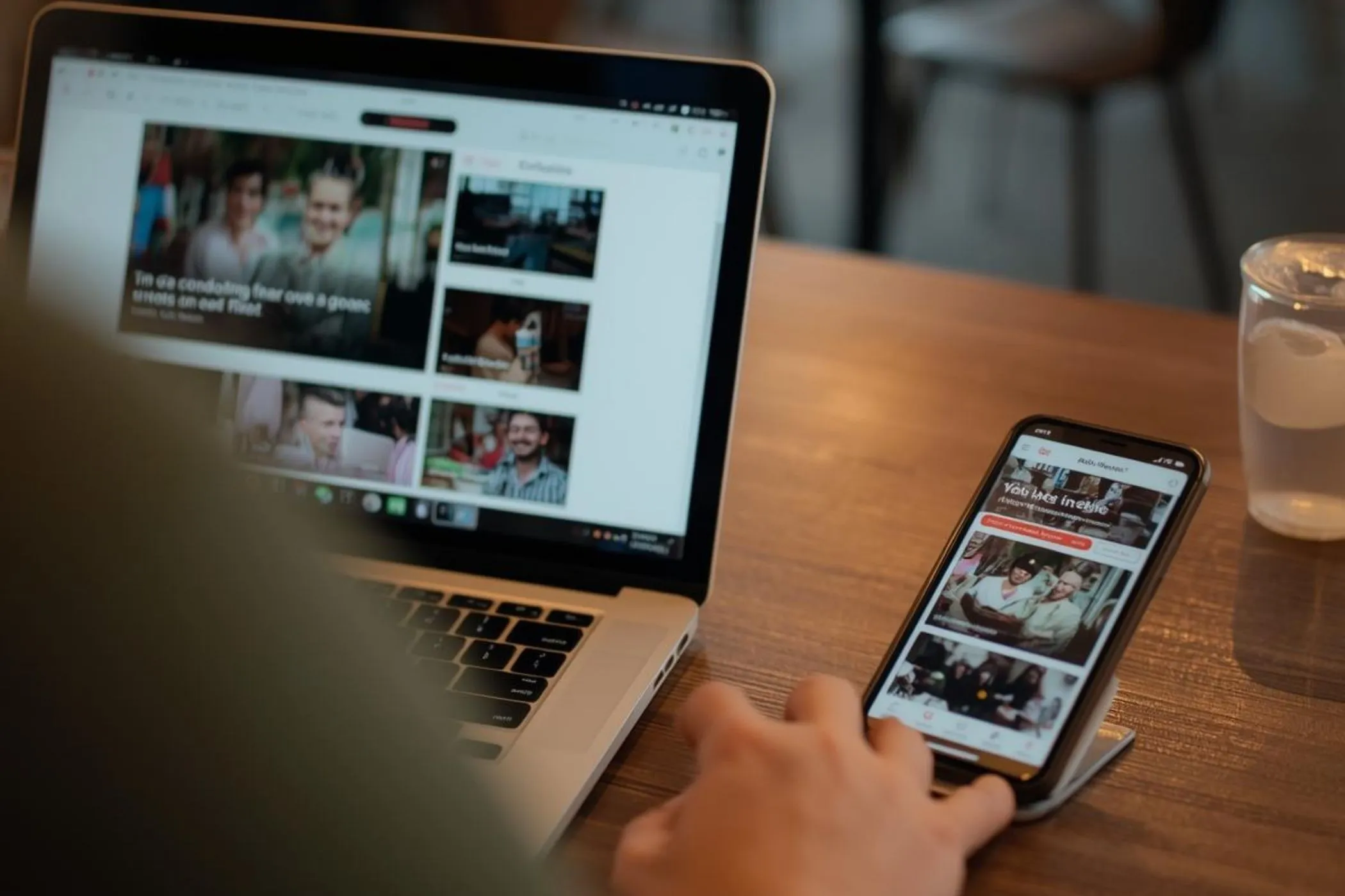
Laptop wallpapers
Many laptops use resolutions close to 1600×900.
Resizing images to this size ensures:
- proper fit without scaling artifacts
- reduced file size compared to Full HD
- sharp display on mid-resolution screens
Web dashboards and admin panels
Dashboards often use medium-sized backgrounds or preview images.
1600×900 works well because it:
- fits widescreen layouts
- loads faster than larger assets
- maintains visual clarity
Presentation visuals
Some presentations or embedded visuals benefit from slightly lighter images than Full HD.
1600×900 provides:
- clean display on widescreen slides
- faster loading in web-based tools
- balanced resolution for sharing
UI previews and mockups
When building or showcasing interfaces, 1600×900 is often used as a reference resolution.
It helps create visuals that feel realistic without being unnecessarily large.
Composition tips for 1600×900 images
Design for medium-resolution viewing
Unlike thumbnails or ultra-high-res visuals, 1600×900 sits in the middle.
Keep details clear but avoid overloading the image with fine elements.
Keep key elements within safe margins
Because cover mode crops edges, place important content slightly inward from the borders.
Use balanced layouts
This resolution works best when visual weight is distributed evenly across the frame.
Optimize for clarity, not just size
1600×900 is often used in functional interfaces, so readability and clarity matter more than dramatic composition.
1600×900 resize use cases
This tool is especially useful when preparing images for:
- laptop backgrounds
- dashboards and admin panels
- presentation visuals
- medium-resolution banners
- UI mockups
- web application previews
Resizing multiple images to this size helps maintain consistency across digital interfaces.
How resizing works
The tool uses a cover resizing algorithm to fit your image into a 1600×900 canvas.
This means:
- The image is scaled proportionally
- It fills the entire frame
- Overflow is cropped from the edges
This preserves aspect ratio while ensuring a clean, distortion-free result.
All processing happens locally in your browser.
Perfect for
- developers building dashboards and tools
- designers creating UI previews
- professionals preparing presentations
- users setting laptop wallpapers
- anyone who needs a balanced, efficient widescreen image size
Resize, export, and your image will fit perfectly into modern medium-resolution widescreen layouts.