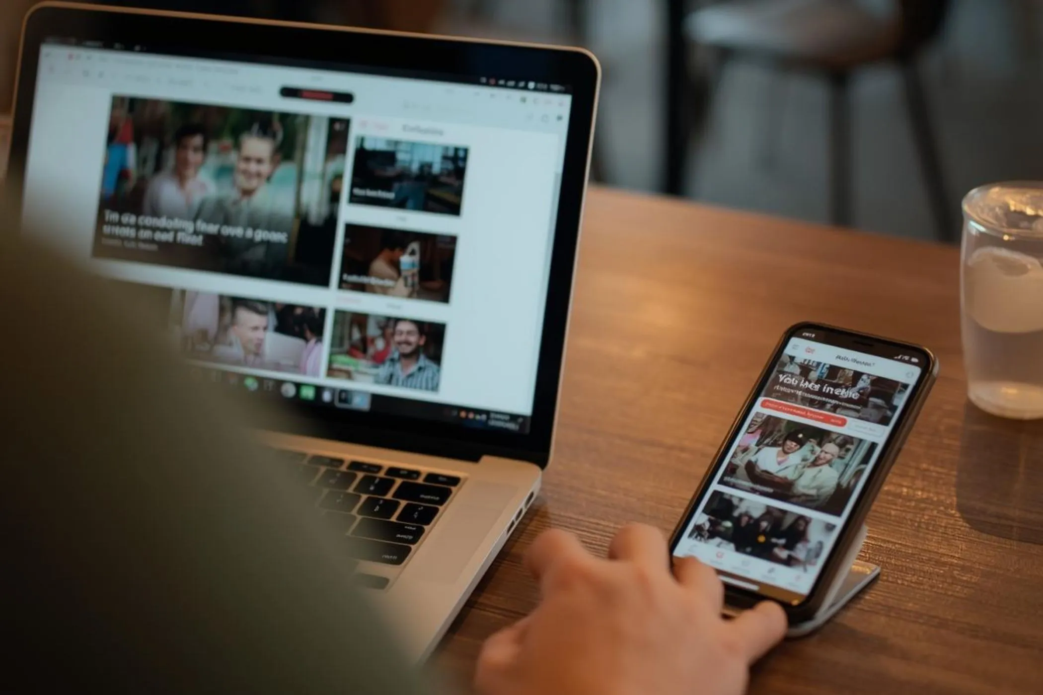
Resize images to 1200×400 (Compact Banner / UI Section)
The 1200×400 resolution is a compact wide format used for UI sections, feature banners, and embedded visuals. It maintains a 3:1 aspect ratio, similar to larger hero banners, but with a reduced height for more modular layouts.
Resizing an image to 1200×400 helps you create visuals that are clean, lightweight, and adaptable, especially for component-based web design.
This tool allows you to resize images to exact 1200×400 dimensions while preserving composition and clarity.
Everything runs locally in your browser, so your images stay private and processing remains fast.
Why 1200×400 works for UI sections
Modern websites are built using modular components rather than single large hero sections. Many of these components require wide but compact visuals.
The 1200×400 format works because it:
- fits into smaller layout sections
- reduces vertical space usage
- keeps pages visually balanced
- loads faster than larger banners
It is commonly used for:
- feature highlight sections
- product cards and previews
- dashboard panels
- embedded banners
What this 1200×400 resizer does
This tool resizes images into an exact 1200×400 banner frame using cover mode, ensuring full coverage without distortion.
You can:
- Drag & drop images into the tool
- Paste images directly from your clipboard
- Automatically fit images into a compact UI canvas
- Preserve aspect ratio while filling the frame
- Resize multiple images at once
- Download individually or export as a ZIP
The preview updates instantly so you can confirm composition before exporting.
How to resize an image to 1200×400
1. Upload your image
Add your image by dragging it into the tool, selecting it manually, or pasting it from your clipboard.
Supported formats:
- JPEG
- PNG
- WebP
2. Automatic cover resizing
The tool applies a cover fit automatically.
This means:
- the image fills the full 1200×400 frame
- aspect ratio is preserved
- edges may be cropped slightly
This ensures a clean, compact banner without stretching.
3. Export your resized image
Download the resized image instantly or export multiple images together as a ZIP file.
Safe area for compact banners
UI banners often include text overlays, icons, or interactive elements.
To avoid layout issues:
- keep important content near the center horizontally
- leave space for UI elements like buttons or labels
- avoid placing key visuals near edges
Smaller banners are more sensitive to cropping, so composition is critical.
Common uses for 1200×400 images
Feature sections
Used to highlight key product features or services within a page.
UI components and cards
Common in dashboards, landing pages, and SaaS interfaces.
Embedded banners
Used inside pages rather than as full hero sections.
Marketing sections
Compact banners help communicate messages without dominating the page.
1200×400 vs larger hero banners
- 1920×600: full hero sections
- 1440×600: responsive hero layouts
- 1200×400: compact UI sections and components
Use 1200×400 when you need modular, space-efficient visuals.
Composition tips for 1200×400 images
Design for tight vertical space
Keep compositions simple and avoid stacking too many elements.
Focus on a single message
Compact banners work best with clear, focused visuals.
Keep focal points centered
Important elements should remain visible across different layouts.
Leave room for overlays
UI elements may be layered on top of the image.
Why your UI banner might look wrong
Common issues include:
- overcrowded layouts
- text overlapping visuals
- important elements cropped
- incorrect aspect ratio
Using the correct size and simplifying composition solves most problems.
1200×400 resize use cases
This tool is especially useful when preparing images for:
- feature sections
- UI components
- dashboards
- landing pages
Resizing multiple images to this format helps maintain consistency across modular layouts.
How resizing works
The tool uses a cover resizing algorithm to fit your image into a 1200×400 canvas.
This means:
- The image is scaled proportionally
- It fills the entire frame
- Overflow is cropped from the edges
This preserves aspect ratio while ensuring a clean, distortion-free result.
All processing happens locally in your browser.
Perfect for
- developers building UI components
- designers creating modular layouts
- SaaS teams designing dashboards
- marketers creating embedded banners
- anyone who needs clean, compact visuals
Resize, export, and your image will fit perfectly into modern UI sections and layouts.