Blurred Background Covers in One Sentence
This tool turns any photo into a clean, social-ready cover by placing your image on top of a blurred, color-tinted background, with optional natural shadow and flexible aspect ratios—all privately in your browser.
What You Can Create With a Blurred Background
Blurred background covers are one of those “looks good everywhere” formats:
- Instagram & TikTok formats: 1:1, 4:5, 9:16, plus more ratios
- No-crop layouts: keep the full photo visible by filling extra space with blur
- Professional gallery frames: minimal blur + higher padding + soft shadow
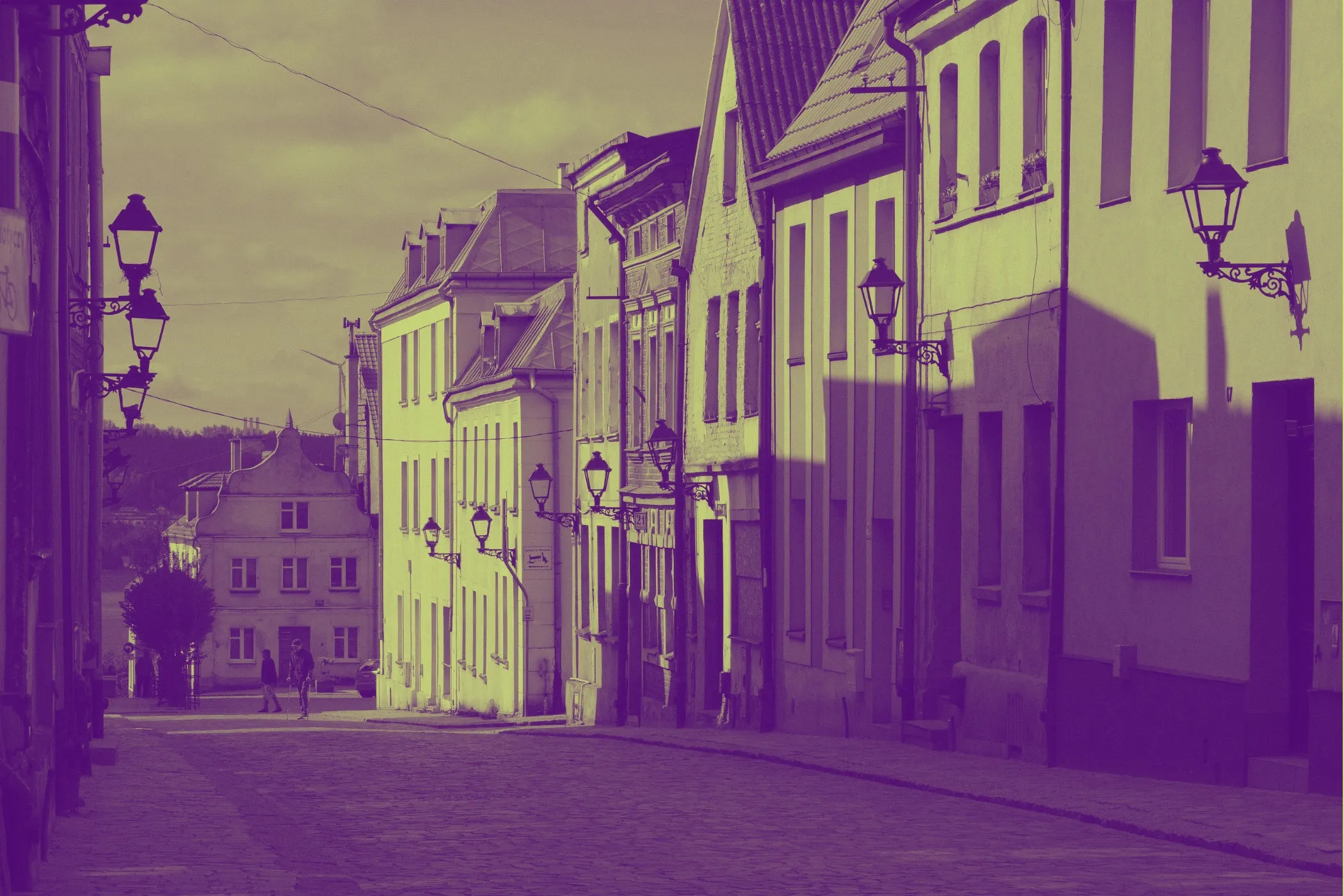
- Moody covers: heavier blur + darker overlay tint
- Brand-friendly visuals: apply a consistent overlay color across a series
- Product or portrait focus: keep the subject sharp while the background supports it
Everything updates with a live preview, and exporting keeps your original format.
Workflow & Usage
1. Add an image
Drag & drop, click to select, or paste a JPEG / PNG / WebP.
2. Pick the output shape
Choose an Aspect ratio (or keep Original).
- 4:5 is a common feed portrait format
- 9:16 is ideal for Stories/Reels
- 16:9 works for headers, thumbnails, and banners
3. Create the “cover look”
Use the controls to balance composition:
- Add Padding to create space around the subject
- Increase Background blur to hide distractions
- Adjust Background scale to avoid sharp edges and keep blur smooth
- Add an Overlay to unify tones
- Add a Shadow for a floating / realistic “foreground” layer
4. Download
Export instantly. The filename is descriptive (includes the chosen aspect ratio) so it’s easy to keep track of versions.
Understanding the Controls
Aspect ratio
Changes the canvas shape (the “frame” your image sits inside).
- Choose a ratio based on where the image will be used.
- “Original” keeps the same width/height as the uploaded image.
Padding
Padding is the single control that most affects composition.
- 0–6%: tight, modern, minimal framing
- 8–14%: balanced “cover” feel (great default range)
- 15–30%: gallery/print vibe with lots of breathing room
Tip: If your subject feels too close to the edge, increase padding slightly.
Background blur
This is the “how much the background melts away” control.
- Low blur keeps background context and texture
- High blur hides detail and creates a clean canvas
Because blur is mapped to the canvas size, the result stays consistent across different resolutions.
Background scale
Scale slightly zooms the background layer.
Why it matters:
- It prevents sharp edges from peeking around the foreground
- It improves the blur’s “smoothness” by avoiding repeated edge detail
- It helps the background feel more like a soft light field behind the subject
Overlay strength & overlay color
Overlay is a simple but powerful design layer.
- Strength controls the opacity
- Color sets the tint
Use it when:
- the blurred background still feels noisy
- you want a brand color wash
- you want a consistent mood across multiple covers
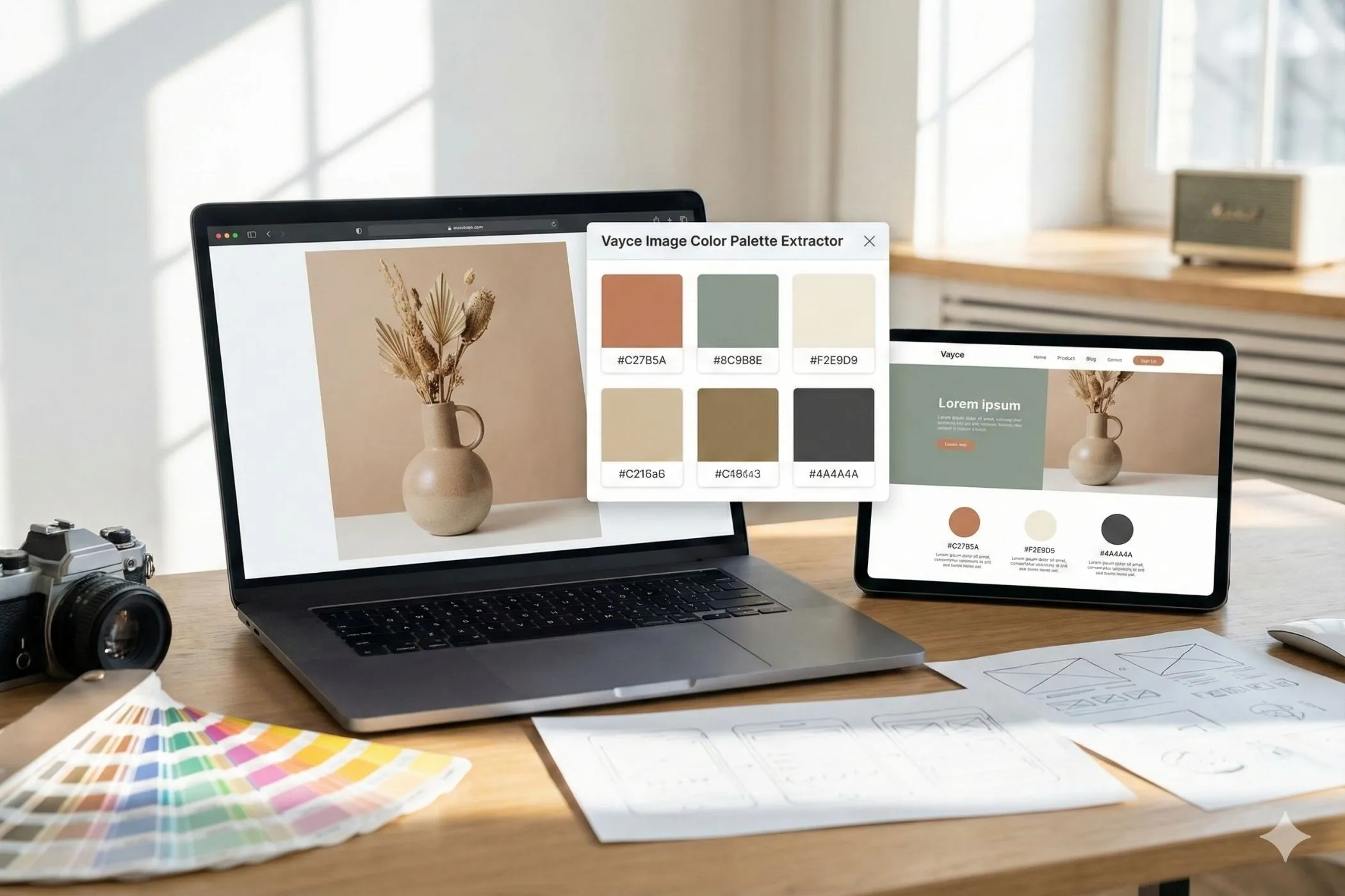
Smart color tip: The tool analyzes your image to extract usable colors, and Surprise Me can pick overlays that fit the photo instead of random hex codes.
Shadow strength
Shadow makes the foreground look like it’s sitting above the background.
- Low shadow: subtle separation (premium/minimal)
- Medium shadow: realistic “card” floating feel
- High shadow: strong separation for busy backgrounds
Shadow direction
Direction controls where the shadow falls.
- 45°: top-right light (shadow down-left)
- 90°: top-down light (shadow down)
- 135°: top-left light (shadow down-right)
Natural-looking covers usually stick to “light from above.”
“Surprise Me” Feature
This tool uses cohesive vibe recipes—curated ranges that tend to look good:
- Gallery Minimalist: more padding, lower blur, clean look
- Deep Atmosphere: heavy blur, darker overlay, cinematic mood
- Vibrant Pop: picks a saturated color from the photo for the overlay
- Soft Float: gentle blur + stronger background scale for airy depth
You still have full control—Surprise Me is best used as a starting point.
Best Settings
Use these as starting points, then tweak to taste.
Clean feed portrait (4:5)
- Aspect: 4:5
- Padding: 10–14%
- Background blur: 50–70%
- Overlay: 10–25% (dark tint or a brand color)
- Shadow: 20–40%
Story / Reel cover (9:16)
- Aspect: 9:16
- Padding: 8–12%
- Background blur: 65–90%
- Overlay: 25–45% (often helps readability)
- Shadow: 25–45%
Minimal “gallery frame”
- Aspect: Original or 1:1
- Padding: 18–25%
- Background blur: 15–35%
- Overlay: 0–10%
- Shadow: 35–55%
Perfect For
- No-crop posting: keep the full photo visible without ugly bars
- Consistent social grids: same ratios, consistent overlay tone
- Product images: clean framing for marketplaces and landing pages
- Portraits: subject stays sharp, background supports the focus
- Thumbnails & banners: create clean negative space for text
- Brand visuals: match a palette or create a recognizable style
Tips for Better Results
- Start with padding, then adjust blur. Composition usually matters more than blur strength.
- If the background still feels messy, add overlay before increasing blur even more.
- If your subject doesn’t “pop”, add a slightly stronger shadow (and keep direction natural).
- For a consistent series, use the same aspect + padding + overlay color, then only tweak blur per photo.
After exporting, you can optimize file size with Image Compressor or convert to web-friendly formats with tools like PNG to WebP.
Common Problems
“The background blur looks too strong / too fake.” Lower Background blur or reduce Overlay strength.
“I can see edges or sharp details behind the photo.” Increase Background scale slightly.
“The cover feels cramped.” Increase Padding by 2–5%.
“The subject doesn’t separate from the background.” Increase Shadow strength, or add a subtle dark overlay.
“The overlay color looks off.” Try a darker overlay at lower strength (10–20%), or use Surprise Me so the overlay is chosen from the image palette.
How It Works
This effect is generated entirely in the browser:
- The image is decoded locally (EXIF orientation supported).
- A background layer is drawn using a cover fit (fills the canvas).
- Blur is applied using a size-aware mapping so the look stays consistent across resolutions.
- A colored overlay is composited with adjustable opacity.
- The original image is drawn on top with contain fit (respects padding).
- A soft, directional shadow is applied to the foreground for depth.
Preview is capped for speed; the download is rendered at full resolution.
