Mosaic Effect in One Sentence
A mosaic effect turns a photo into tiled artwork by dividing it into colored pieces, separating them with grout, and optionally adding irregular shapes and beveled edges to mimic real ceramic, stone, or glass mosaics.
Why Mosaic Effects Look So Good
Mosaic styling works because it transforms a normal image into something that feels:
- crafted
- decorative
- architectural
- textural
- artisanal
Instead of looking like a flat photograph, the image starts to resemble:
- hand-laid tile art
- stained glass
- ceramic wall decor
- pool tiling
- cobblestone or pebble mosaic work
That combination of simplification, texture, and visible structure gives the image a strong visual identity.
What This Tool Does
This tool converts images into a controllable mosaic pattern directly in the browser.
You can:
- choose between Square tiles or Organic Rock cells
- adjust Tile Size for fine vs bold mosaics
- control Grout Thickness for cleaner or chunkier separation
- add 3D Bevel so tiles feel physical and raised
- introduce Hand-Laid Irregularity so the pattern feels handmade
- choose a custom Grout Color
- use Surprise me ✨ to jump into curated mosaic styles
- export instantly in the same format as the original image
Everything happens locally on your device: fast, private, and easy to experiment with.
Workflow & Usage
1. Add an image
Drag & drop or click to select a JPEG, PNG, or WebP file.
This effect works especially well on images with:
- clear shapes
- strong color zones
- readable contrast
- a subject that stays recognizable when simplified into tiles
2. Choose the tile style
Start with Tile Shape:
- Square for ceramic, pixel-like, or pool-tile patterns
- Organic Rock (Voronoi) for stone, stained glass, or hand-laid mosaic looks
This is the biggest visual decision, because it changes the entire character of the effect.
3. Set the tile scale
Use Tile Size to decide how detailed or simplified the mosaic becomes.
- Smaller tiles keep more image detail
- Larger tiles create bolder, more abstract mosaics
4. Add physical realism
Use Tile 3D Volume (Bevel) to add highlights and shadows around edges.
This makes the result feel more like:
- glazed ceramic
- glass pieces
- raised stone fragments
- physical mosaic tiles with depth
5. Make it feel handmade
Increase Hand-Laid Irregularity to break the perfect grid or cell alignment.
This helps the result feel less digital and more handcrafted.
6. Tune the mortar
Use Grout Thickness and Grout Color to control how strongly tiles are separated.
This is a major style lever:
- thin grout = cleaner, more modern look
- thick grout = stronger handcrafted tile separation
- light grout = pool / bathroom / ceramic feel
- dark grout = stained glass / stone / dramatic contrast
7. Try Surprise Me
Use Surprise me ✨ to quickly explore curated looks like:
- cobblestone path
- stained glass
- pool tiles
8. Download
Export instantly in the original format with a filename such as:
image-mosaic.jpg
Understanding the Controls
Tile Shape
This chooses the overall structure of the mosaic.
Square
This creates a more regular tiled grid.
Best for:
- ceramic tile looks
- pool wall aesthetics
- decorative geometric mosaics
- cleaner, more controlled layouts
Because the tiles are uniform, the result feels more orderly and architectural.
Organic Rock (Voronoi)
This creates irregular, natural-looking cells.
Best for:
- stone mosaics
- stained-glass effects
- pebble or cobblestone aesthetics
- handmade decorative patterns
Because the shapes vary, the result feels more organic, artisanal, and visually rich.
Tile Size
This controls how large each tile or cell becomes.
Practical ranges:
- 5–12 → fine detail, smaller mosaic pieces
- 12–25 → balanced all-purpose mosaic
- 25–45 → bold decorative tiles
- 45–80 → highly simplified, graphic mosaic blocks
Smaller sizes preserve more subject detail. Larger sizes create a more abstract and stylized result.
Tile 3D Volume (Bevel)
This adds edge highlights and shadows so tiles look raised instead of flat.
What it changes visually:
- makes tiles feel more physical
- gives ceramic and glass pieces a polished edge
- adds depth and realism
- improves the illusion of individually placed pieces
Practical ranges:
- 0–15 → flat tile look
- 15–40 → subtle dimensionality
- 40–70 → clear 3D tile edges
- 70–100 → bold, pronounced raised-tile effect
Hand-Laid Irregularity
This adds procedural variation to tile placement and shape.
What it changes visually:
- breaks up perfect alignment
- makes square tiles feel less machine-cut
- makes organic cells feel more natural and hand-set
- adds visual charm and realism
Practical ranges:
- 0–15 → very clean and regular
- 15–40 → slight handmade character
- 40–70 → strong artisanal irregularity
- 70–100 → very loose, expressive, imperfect patterning
For a realistic handcrafted feel, moderate settings often work best.
Grout Thickness
This controls how much visible separation exists between the tiles.
What it changes visually:
- thin grout keeps the image tighter and more detailed
- thicker grout increases structure and makes each tile stand out more
- heavy grout can push the effect toward stained glass or bold masonry styles
Practical ranges:
- 0–1 → almost no separation
- 1–3 → subtle grout lines
- 3–6 → classic mosaic separation
- 6–12 → bold grout / mortar structure
Grout Color
This changes the visible mortar or separator color between tiles.
This is a surprisingly powerful style control.
Popular directions:
- Dark gray / black → stained glass, dramatic stone, high contrast
- Light gray / white → pool tiles, ceramic, clean modern surfaces
- Warm beige / brown → old masonry, rustic tile, earthy decor
- Colored grout → playful decorative art and custom branding looks
Curated Looks You Can Create
The Surprise me ✨ button jumps between useful mosaic archetypes rather than random noise.
Cobblestone Path
- Organic Rock tiles
- Medium / large tile size
- Moderate grout
- Strong irregularity
- Strong bevel
- Dark grout
Best for:
- rustic textures
- outdoor stone aesthetics
- earthy decorative edits
Stained Glass
- Organic Rock tiles
- Larger cells
- Thicker grout
- Heavy irregularity
- Lighter bevel
- Black grout
Best for:
- church-window style art
- decorative color panels
- bold artistic reinterpretations
Pool Tiles
- Square tiles
- Smaller tile size
- Thin grout
- Low irregularity
- Strong bevel
- Light grout
Best for:
- ceramic tile looks
- clean bathroom / pool styling
- geometric decorative patterns
Best Settings (Copy These)
Use these as strong starting points.
Clean Ceramic Tile
- Tile Shape: Square
- Tile Size: 10–18
- Bevel: 45–80
- Hand-Laid Irregularity: 0–20
- Grout Thickness: 1–3
- Grout Color: Light gray / white
Best for:
- pool tiles
- bathroom-style surfaces
- neat decorative patterns
Classic Mosaic Wall Art
- Tile Shape: Square or Organic Rock
- Tile Size: 15–28
- Bevel: 30–60
- Hand-Laid Irregularity: 20–45
- Grout Thickness: 2–5
- Grout Color: Dark gray
Best for:
- all-purpose mosaic conversions
- decorative prints
- wall-art style visuals
Stained Glass Look
- Tile Shape: Organic Rock
- Tile Size: 30–50
- Bevel: 10–30
- Hand-Laid Irregularity: 55–85
- Grout Thickness: 4–7
- Grout Color: Black
Best for:
- bold color artwork
- window-like glass aesthetics
- dramatic decorative effects
Cobblestone / Stone Mosaic
- Tile Shape: Organic Rock
- Tile Size: 22–35
- Bevel: 50–75
- Hand-Laid Irregularity: 40–70
- Grout Thickness: 2–4
- Grout Color: Dark charcoal / earthy brown
Best for:
- rustic stone looks
- earthy scenes
- architectural textures
Bold Abstract Mosaic
- Tile Shape: Organic Rock or Square
- Tile Size: 35–60
- Bevel: 20–50
- Hand-Laid Irregularity: 30–70
- Grout Thickness: 3–8
- Grout Color: High-contrast dark or light
Best for:
- stylized posters
- abstract art
- highly simplified decorative images
Best Images for a Mosaic Effect
This effect works best when the source image has:
- bold shapes
- clear subject separation
- distinct color regions
- enough contrast to remain readable after tiling
The strongest image types are usually:
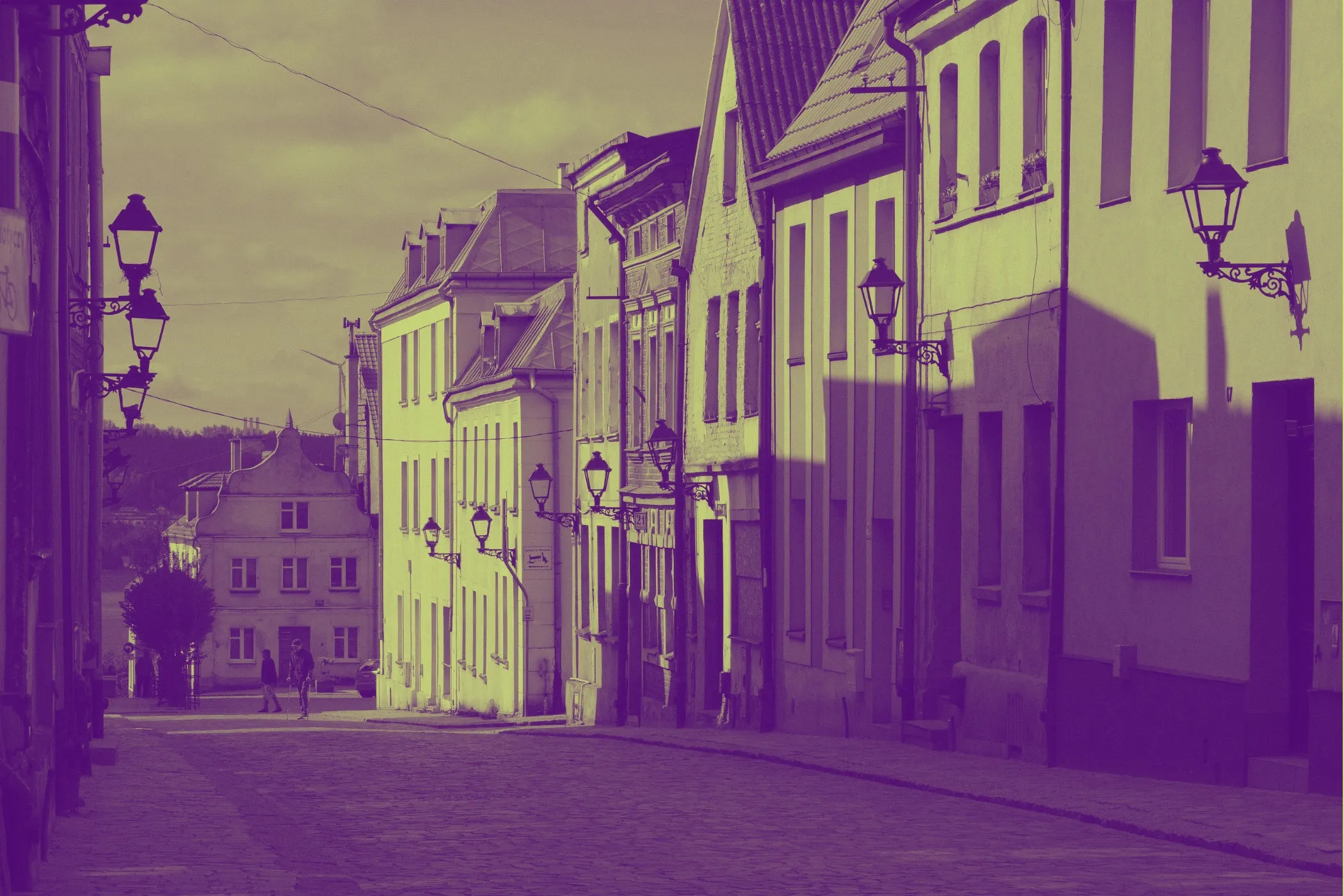
Architecture and streetscapes
Buildings, rooftops, walls, windows, and paths naturally pair with tile and stone aesthetics.
Portraits with simple backgrounds
A portrait can look beautiful in mosaic form if the subject is clearly separated and the background is not too busy.
Landscapes with strong color zones
Sky, sea, grass, mountains, and large natural shapes can simplify into beautiful decorative tile patterns.
Illustrations and graphic artwork
Bold shapes and flat colors often translate extremely well into mosaic styles.
Floral and decorative still life
Flowers, ceramic objects, and decorative scenes often feel naturally “mosaic friendly.”
Less ideal:
- very blurry images
- low-contrast scenes
- highly cluttered backgrounds
- tiny detailed text that needs to stay perfectly readable
Perfect For
- Wall-art mockups
- Stained-glass style graphics
- Pool tile and ceramic visuals
- Cobblestone and stone-inspired textures
- Decorative social posts
- Travel and architecture photos with an artisanal finish
- Creative gift-style photo transformations
- Brand visuals that need a handcrafted, textured feel
Tips for Better Results
Choose the style first
A good order is:
- Set Tile Shape
- Choose Tile Size
- Add Bevel
- Add Irregularity
- Tune Grout Thickness
- Finish with Grout Color
That keeps the structure of the mosaic clear while you refine the style.
Use smaller tiles for portraits
Faces and detailed subjects usually hold up better with smaller tile sizes.
Large tiles can work, but they quickly become abstract.
Use larger tiles for decorative art
If you want a bold wall-art or poster feel, larger tiles often look more intentional and artistic.
Let grout do some of the styling
The grout is not just a separator. It changes the mood of the entire image.
- darker grout = stronger outlines and drama
- lighter grout = cleaner, brighter, more polished surfaces
Use bevel as a realism control
If the result feels too flat, increase Bevel before increasing more complexity elsewhere.
Common Problems (Quick Fixes)
“It looks too abstract.” Reduce Tile Size first. Smaller tiles preserve more image detail.
“It feels too flat.” Increase Bevel. That usually adds the most realistic depth.
“It looks too perfect and digital.” Raise Hand-Laid Irregularity so the tiles feel less machine-aligned.
“The image is too busy.” Use larger tiles, but also slightly reduce irregularity and keep grout moderate.
“The grout is overpowering.” Reduce Grout Thickness or use a grout color with less contrast.
“I want a stronger stained-glass feel.” Use Organic Rock, larger tiles, black grout, moderate-to-high irregularity, and lower bevel.
How It Works
This effect is generated in the browser using two different mosaic construction modes.
Square Tiles Mode
- The image is sampled into a regular tile grid.
- Each tile takes its color from the source image.
- Grout is drawn between tiles.
- Optional jitter slightly shifts and rotates tiles for a hand-laid feel.
- Optional bevel adds highlights and shadows to create raised tile depth.
Organic Rock Mode
- The image is divided into irregular anchor regions using a fast cellular / Voronoi-style layout.
- Each region becomes a tile-like “stone” cell.
- Grout is drawn along the boundaries between neighboring cells.
- Jitter changes anchor positions to create natural irregularity.
- Bevel shading is added near edges to create volume and separation.
The result is a flexible mosaic generator that can move between clean ceramic tile art and irregular stone or stained-glass interpretations.
Why This Looks Better Than a Basic Pixelate Filter
A simple pixelate filter only breaks an image into blocks.
That can be useful, but it does not create the feeling of real tile or mosaic craftsmanship.
This effect adds the extra layers that make the result feel physical:
- actual grout / mortar separation
- optional irregular hand-laid placement
- square or organic tile structures
- beveled depth for dimensionality
That is what turns a plain blocky image into something that feels more like a decorative surface or handmade mosaic.
Design Notes
The best mosaic effects usually balance:
- enough tile size to create visible structure
- enough detail to keep the subject recognizable
- enough grout to separate pieces clearly
- enough irregularity to feel handmade
- enough bevel to feel physical without becoming overly artificial
Too little structure, and it just looks lightly pixelated. Too much, and the subject disappears.
That balance is what makes this tool useful for both realistic decorative surfaces and stylized artistic transformations.
If you want one reliable “looks good fast” starting point:
Organic Rock + Tile Size 20–28 + Bevel 40–60 + Irregularity 35–50 + Grout 2–4 + Dark Gray Grout
That range usually creates a strong, attractive mosaic look on portraits, architecture, landscapes, and decorative images.