Color Replace Tool in One Sentence
This tool lets you replace one color with another — or with transparency — while controlling how the match behaves, how softly it blends, and how much of the original shading is preserved.
What “Replace Color” Actually Means
Color replacement is a targeted recoloring workflow.
Instead of adjusting the whole image, it identifies pixels close to a chosen source color and shifts them toward a new output color.
That sounds simple, but useful color replacement is not just about swapping hex values.
A real image usually contains:
- highlights
- shadows
- texture
- anti-aliased edges
- compression artifacts
- nearby hues that are similar but not identical
That is why a practical color replacer needs more than one slider.
It needs controls for:
- how broad the color match is
- how soft the transition edge should be
- how strongly the recolor should be applied
- whether the original light and shadow structure should stay intact
- whether the selected region should become a new color or become transparent
That is exactly what this tool is built for.
What This Tool Does
This tool helps you selectively recolor parts of an image directly in the browser.
You can:
- click the preview to pick the source color you want to target
- click again to pick the replacement color
- type exact hex values manually
- build a replacement stack with multiple recolor steps
- control Tolerance to widen or narrow the match
- control Softness to feather the transition edges
- control Strength to blend between original and recolored pixels
- turn on Preserve Shading to keep highlights and shadows more natural
- switch a step to Replace with Transparency instead of recoloring
- preview the active mask to inspect the current match
- duplicate, reorder, disable, or remove changes
- export the final image instantly
Everything is processed locally in your browser, so the workflow stays fast, private, and easy to iterate on.
Why This Is More Useful Than a Basic Recolor Filter
Many simple recolor tools work like a blunt paint bucket.
They can be fine for flat graphics, but they often struggle with real photos because:
- one object rarely contains one perfectly uniform color
- edges need feathering to avoid obvious cut lines
- shadows and highlights should not be flattened
- some edits should be partial, not 100% forced
- some users need transparency instead of a replacement color
This tool is more flexible because it includes:
- source and replacement color picking
- multiple replacement steps
- tolerance-based matching
- softness for cleaner blends
- strength for partial or full recolor
- preserve shading for natural lightness structure
- replace with transparency for cutout-style workflows
- mask preview for troubleshooting
That makes it usable for both clean graphic recoloring and more believable photo edits.
Workflow & Usage
1. Upload an image
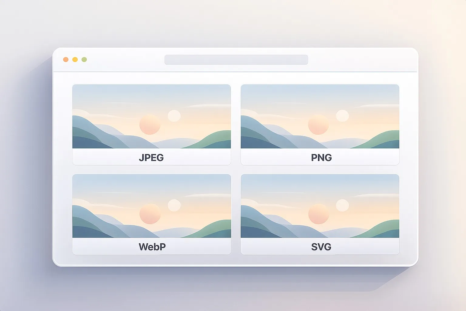
Drag & drop or click to select a JPEG, PNG, or WebP image.
This tool works well on logos, product photos, flat illustrations, icons, clothing details, and many everyday images where one color needs to be changed selectively.
2. Pick the source color
Choose Pick source, then click directly on the preview to sample the color you want to replace.
You can also type a hex value manually if you already know the exact starting color.
This is useful when:
- you know the brand color already
- you want consistency across multiple images
- you are matching a UI color or product swatch
3. Pick the replacement color
Switch to Pick replacement and choose the new color you want the matched area to move toward.
You can also enter the replacement as a hex value manually.
This is useful when you want to:
- recolor a logo
- change the color of an object or garment
- test branding variations
- prepare alternate visual treatments
4. Adjust the match
Use the active step controls:
- Tolerance determines how broad the source-color match is
- Softness controls how gently the recolor blends into surrounding pixels
- Strength controls how strongly the replacement is applied
These three settings do most of the real work.
5. Decide whether to preserve shading
Turn on Preserve Shading when you want the recolored area to keep more of its original highlights, shadows, and texture.
This usually works best for:
- clothing
- products
- painted surfaces
- objects with folds or volume
- most photographic recoloring
Turn it off when you want a flatter, more direct shift toward the replacement color.
6. Use transparency when needed
If the selected color should disappear instead of change to another color, enable Replace with Transparency.
This is useful for:
- removing a background color
- clearing a colored overlay or mark
- punching out a selected area for design work
- preparing assets for further editing
7. Add more changes if needed
You can stack multiple recolor steps in one edit.
Examples:
- turn blue into green and red into orange
- recolor a logo with multiple brand tones
- adjust several clothing accents in a single pass
- combine recolor and transparency changes together
Each step can be:
- enabled or disabled
- duplicated
- moved up or down
- removed
8. Preview the active mask when needed
Turn on Preview Active Change Mask when you want to inspect exactly what the current step is catching.
This is especially helpful if:
- the recolor is affecting the wrong regions
- important parts of the target are being missed
- the transition edge looks too harsh
- similar colors exist elsewhere in the image
9. Download
When the result looks right, export the image instantly.
The preview is optimized for responsiveness, while the downloaded image is rendered at full resolution.
Understanding the Controls
Source Color
This is the color the current step tries to target.
You can set it by:
- clicking the preview with Pick source active
- using the color input
- typing a hex value directly
A good source sample is usually a representative midtone from the area you want to replace, not the brightest highlight or darkest shadow.
That usually gives a more stable match.
Replace With
This is the color the matched pixels move toward.
You can set it by:
- clicking the preview with Pick replacement active
- using the color input
- typing a hex value directly
The final result will depend not just on the replacement color, but also on Strength and whether Preserve Shading is enabled.
Replacement Stack
The replacement stack lets you apply multiple color changes in one image.
That matters because many real images contain more than one target color.
Examples:
- recolor a two-tone logo
- change separate clothing accents
- update multiple UI colors in a mockup
- remove one color with transparency while recoloring another
Each step can be:
- enabled or disabled
- duplicated
- reordered
- removed
Step order matters when different changes affect overlapping parts of the image.
Tolerance
Tolerance controls how far from the chosen source color the match can extend.
Lower values create:
- narrower matching
- more precise targeting
- less spill into nearby hues
Higher values create:
- broader matching
- more preserved tonal variation within the target area
- more forgiving behavior across highlights and shadows
Practical ranges:
- 0–15 → very narrow match
- 15–35 → controlled selective recolor
- 35–60 → broader real-world color matching
- 60–100 → wide match, useful for large variation or rough targeting
If part of the intended area is not changing, increase Tolerance first.
Softness
Softness feathers the edge of the active mask.
Lower values create:
- harder transition edges
- more graphic cutout behavior
- cleaner but less forgiving isolation
Higher values create:
- smoother blending
- softer transitions into nearby pixels
- more natural results on real photos
Practical ranges:
- 0–10 → crisp edge behavior
- 10–30 → balanced softness
- 30–55 → natural feathering
- 55–100 → very soft transition
If the recolor looks pasted on, increase Softness before pushing tolerance too far.
Strength
Strength controls how far the pixels move from the original color toward the replacement result.
Lower values produce:
- subtle tinting
- gentler recoloring
- more of the original color left visible
Higher values produce:
- stronger recolor
- clearer before/after separation
- more direct color replacement
Practical ranges:
- 0–20 → faint tint
- 20–50 → moderate recolor
- 50–80 → clear visible change
- 80–100 → strong replacement
This makes the tool useful for both soft color grading and direct recolor work.
Preserve Shading
Preserve Shading keeps the original lightness structure while shifting the selected area toward the new hue.
What that means visually:
- highlights stay brighter
- shadows stay darker
- surface texture remains more believable
- folds, depth, and material detail survive better
This usually gives more natural results on:
- fabric
- objects
- products
- painted surfaces
- photographic subjects
Turn it off when you want a flatter, more synthetic, or more graphic recolor.
Replace With Transparency
Instead of pushing matched pixels toward a new color, this option fades them out.
This is useful for:
- removing a flat colored background
- knocking out a selected accent color
- preparing partial overlays
- making cutout-style graphic assets
The result is still governed by the match behavior, so Tolerance, Softness, and Strength continue to matter.
Preview Active Change Mask
Mask preview turns the active step into a grayscale view so you can see what the current match is selecting.
This is one of the most useful troubleshooting tools because it reveals:
- where the match is too narrow
- where it is leaking into the background
- whether softness is too low
- whether another step is needed
If the recolor looks wrong, the mask usually explains why.
Best Settings
These are strong starting points, not rigid rules.
Natural Product Recolor
- Tolerance: 18–32
- Softness: 16–28
- Strength: 65–90
- Preserve Shading: On
Best for:
- product mockups
- packaging color variants
- shoes, bottles, electronics
- branded object recoloring
Clothing or Fabric Color Change
- Tolerance: 22–40
- Softness: 22–38
- Strength: 55–85
- Preserve Shading: On
Best for:
- shirts
- dresses
- jackets
- textile accents
- folds and textured material
Flat Logo or Icon Recolor
- Tolerance: 8–22
- Softness: 4–14
- Strength: 90–100
- Preserve Shading: Off or On depending on artwork
Best for:
- logos
- icons
- UI graphics
- stickers
- simple brand assets
Partial Tint or Gentle Recolor
- Tolerance: 18–34
- Softness: 18–30
- Strength: 20–50
- Preserve Shading: On
Best for:
- subtle creative edits
- mood variations
- lightly tinted surfaces
- editorial imagery
Remove a Flat Background Color
- Tolerance: 10–26
- Softness: 4–18
- Strength: 80–100
- Replace With Transparency: On
Best for:
- simple backdrops
- graphic marks
- flat fills
- prepared overlay assets
Multi-Step Brand Recolor
- Tolerance: 15–35 per step
- Softness: 10–26 per step
- Strength: 70–100 per step
- Preserve Shading: depends on image type
Best for:
- logo systems
- branded illustrations
- colorway tests
- product family variations
Best Images for Color Replacement
This tool usually works best on images with:
- a clear target color
- enough contrast between target and surrounding areas
- reasonably clean edges
- enough tonal variation to benefit from shading preservation
- a subject that visually depends on one or a few key color regions
Especially strong candidates:
Logos and icons
Flat colors are easy to target and recolor cleanly.
Product photography
Bottles, shoes, electronics, packaging, and other objects often benefit from trying alternate colorways without rebuilding the image.
Clothing and accessories
Color replacement is often useful for shirts, dresses, bags, shoes, hats, and styled apparel mockups.
UI mockups and graphics
You can test alternate palette directions by recoloring interface accents or graphic components.
Simple backgrounds and overlays
Replacing with transparency can help remove uniform colored areas for later use in other designs.
Less ideal candidates:
- very noisy images
- heavily compressed photos
- subjects with many near-identical background colors
- scenes where the target color appears everywhere
- extremely low-contrast images
Perfect For
- replace one color with another in an image
- recolor logos and icons
- change shirt color in a photo
- test product color variations
- swap brand colors in marketing graphics
- remove a selected color with transparency
- fine-tuned selective recolor work
- multiple color replacements in one edit
Tips for Better Results
Sample a representative midtone
Do not sample only the brightest highlight or darkest shadow. A midtone from the target area usually gives the most stable match.
Increase tolerance before adding too many duplicate steps
If most of the target is already being caught, try increasing Tolerance first. Add another step only when you truly need to target a different hue or lighting variation.
Use softness to fix harsh edges
If the recolor looks cut out, the issue is often edge blending rather than match range. Increase Softness before making the selection overly broad.
Keep preserve shading on for realism
For products, clothing, and photographic objects, Preserve Shading usually gives more believable results.
Lower strength for a more natural recolor
A full-strength replacement is not always best. Moderate strength often feels more convincing when the goal is realism.
Use mask preview early
Mask preview makes it much easier to understand why a recolor is missing areas or leaking into places it should not reach.
Reorder steps if edits overlap
In a multi-step recolor, one change can affect the input for the next. If the result looks off, try changing step order.
Common Problems (Quick Fixes)
“The recolor is affecting too much of the image.” Lower Tolerance first, then check the mask preview to see where the spill is happening.
“Parts of the target are not changing.” Increase Tolerance slightly, or add another step for a different shade.
“The edges look too harsh.” Increase Softness for a cleaner transition.
“The new color looks too fake or too flat.” Turn on Preserve Shading or reduce Strength slightly.
“The result is too weak.” Increase Strength first, then widen Tolerance if needed.
“The wrong background objects are being recolored.” Use Preview Active Change Mask, lower tolerance, or split the edit into more precise steps.
“Transparency removal looks messy.” Lower Tolerance and increase Softness slightly so the removal follows the target more cleanly.
“The flat logo did not fully recolor.” Raise Strength to near full and keep Softness low for crisper graphic edges.
How It Works
This tool processes your image directly in the browser.
- The image is decoded locally.
- A working canvas is created for preview or export.
- The source and replacement colors are converted into a perceptual color space.
- Each pixel is compared against the selected source color.
- A soft mask is built from the current Tolerance and Softness settings.
- The matched area is blended toward the replacement color using Strength.
- If Preserve Shading is enabled, the original lightness structure is kept more intact.
- If Replace with Transparency is enabled, matched pixels fade out instead of being recolored.
- Additional steps are applied in order when you use the replacement stack.
Because the matching is based on perceptual color distance rather than a simplistic channel-only rule, the tool behaves more reliably across real images with varying highlights and shadows.
Why This Looks Better Than a Basic Paint-Bucket Recolor
A basic recolor method often produces:
- harsh edges
- obvious spill into neighboring pixels
- flattened texture
- missing highlights and shadows
- unnatural-looking output
This tool improves that workflow by adding:
- perceptual color matching
- feathered mask transitions
- partial-strength blending
- optional shading preservation
- transparency replacement
- multiple stacked changes
- mask inspection
That makes it more useful for both fast edits and more controlled, polished recoloring work.
Design Notes
The best color replacement edits usually balance four things:
- clean targeting
- natural transitions
- enough replacement strength to read clearly
- enough original structure to keep the image believable
Too much tolerance can make the edit spill. Too little tolerance can leave the target patchy. Too little softness can create a cutout look. Too much strength can make the recolor feel synthetic. Turning off preserve shading can flatten the object when realism matters.
A reliable starting point for many real-world images is:
Choose a representative source color, set Tolerance around 20–30, Softness around 16–26, Strength around 70–90, and keep Preserve Shading on.
That range usually creates a controlled and believable recolor for products, clothing, icons, and everyday image edits.