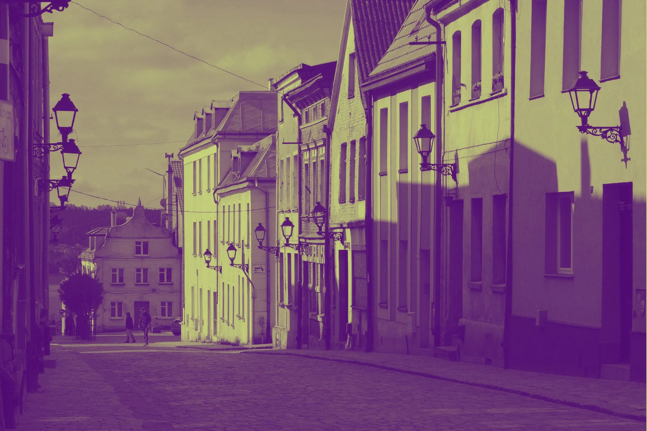
Gradient Map Effect in One Sentence
This tool recolors an image by mapping its tonal range to a custom five-stop gradient, letting you turn ordinary photos into cinematic, stylized, or brand-aligned artwork with much more control than a simple filter.
What a Gradient Map Actually Does
A gradient map does not just place a color overlay on top of an image.
Instead, it reads the brightness structure of the image and assigns colors based on tone.
That means:
- the darkest areas can become one color
- dark midtones can become another
- midtones can shift into a third
- lighter areas can move into a fourth
- highlights can be pushed into a fifth
This is why gradient maps are so useful for:
- cinematic color grading
- posterized photo treatments
- album art
- editorial visuals
- branded social graphics
- concept art references
- game and moodboard aesthetics
A good gradient map keeps the image readable while completely changing its emotional temperature.
Why Use a Gradient Map Instead of a Normal Filter?
Most one-click filters change color globally.
A gradient map is more deliberate.
It lets you decide what happens to:
- shadows
- dark midtones
- midtones
- light midtones
- highlights
That gives you much better control over how the final image feels.
For example:
- cool shadows + warm highlights can feel cinematic
- violet shadows + peach highlights can feel dreamy and editorial
- green shadows + yellow highlights can feel acidic and graphic
- sepia shadows + creamy highlights can feel vintage and refined
If you care about color storytelling, gradient mapping is one of the most useful image effects you can have.
What This Tool Does
This tool applies a customizable five-color gradient map to your image directly in the browser.
You can:
- choose from curated presets
- edit all five tonal color stops manually
- blend between the original image and the full gradient-mapped result
- shift exposure darker or lighter
- increase or reduce contrast
- bias the tonal remapping toward shadows or highlights
- preserve more local detail for a cleaner, less muddy result
- generate quick directions with Surprise me ✨
- download the final image instantly
Everything runs locally on your device, so it is private, responsive, and easy to experiment with.
Workflow & Usage
1. Add your image
Drag & drop or click to select a JPEG, PNG, or WebP.
Photos with clear lighting and readable contrast usually respond best, but flatter images can also work well if you push contrast and midtone bias carefully.
2. Choose a preset or build your own palette
The tool includes ready-made looks such as:
- Cinematic Teal / Gold
- Synthwave
- Infrared Pop
- Forest Mist
- Violet / Peach
- Ember Dusk
- Ice / Fire
- Steel / Amber
- Noir Rose
- Acid Lime
- Sepia Deluxe
- Comic Sunset
Each preset defines five tonal stops:
- Shadows
- Dark midtones
- Midtones
- Light midtones
- Highlights
You can also edit each color manually to create your own mapping.
3. Shape the tonal mapping
Use the main controls to decide how the image is interpreted before the colors are applied:
- Effect Strength blends between the original and the mapped result
- Exposure shifts the image darker or lighter before color remapping
- Contrast changes how separated or compressed the tones feel
- Midtone Bias changes whether the image favors shadow-side or highlight-side tonal emphasis
- Detail Preservation helps maintain texture and local separation
4. Refine the palette
Once the tones feel right, fine-tune the five colors.
Often the fastest path is:
- choose a preset close to your goal
- adjust exposure and contrast
- tweak one or two palette stops
- raise or lower detail preservation if the result feels too smooth or too harsh
5. Download
Export the final image when you are happy with the look.
The preview is capped for responsiveness, while the final download renders at full resolution.
Understanding the Five Color Stops
This tool uses five palette anchors instead of two.
That matters because real images do not just contain “dark” and “light.” They live in transitions.
Shadows
This controls the darkest parts of the image.
Use it to define:
- mood
- depth
- atmosphere
- contrast foundation
Deep navy, charcoal, violet, forest green, and near-black tones usually work well here.
Dark Midtones
This shapes the area just above the deepest shadows.
It is important because it influences how the image moves out of darkness.
Use it to add:
- cinematic undertones
- richer body in the lower tonal range
- smoother movement into the midtones
Midtones
This is often the emotional center of the palette.
Skin, walls, fog, fabric, sky transitions, and other common image regions often pass through the midtone stop.
Changing this color can dramatically alter the whole feel of the image.
Light Midtones
This controls the bridge between the body of the image and the highlights.
It helps create:
- glow
- warmth
- separation in bright areas
- cleaner transitions before the highlights
Highlights
This defines the brightest parts of the image.
Use it to decide whether the image ends in:
- warm light
- crisp neutral brightness
- glowing cream
- stylized neon lift
A good highlight color can make the entire palette feel intentional.
Understanding the Controls
Effect Strength
This blends between the original image and the gradient-mapped version.
- lower values keep more of the original color and realism
- higher values fully commit to the new palette
Practical ranges:
- 0–25 → subtle recoloring
- 25–60 → balanced stylization
- 60–85 → clearly graded look
- 85–100 → full gradient map treatment
Exposure
Exposure shifts the tonal input darker or lighter before the gradient is applied.
This changes which parts of the image fall into each palette stop.
Use it when:
- the image feels too shadow-heavy
- highlights are not reaching the lighter stops
- you want more of the composition to live in the middle of the gradient
Practical ranges:
- lower values → darker overall mapping
- middle values → balanced mapping
- higher values → brighter overall mapping
Contrast
Contrast changes how tightly or strongly the tones are separated before the palette is mapped.
Lower contrast produces:
- flatter transitions
- softer grading
- smoother palette movement
Higher contrast produces:
- punchier separation
- stronger graphic structure
- more dramatic palette jumps
Practical ranges:
- 0–25 → soft and muted
- 25–55 → natural grading
- 55–80 → bold cinematic punch
- 80–100 → very graphic remapping
Midtone Bias
Midtone Bias changes where the tonal center of the image sits.
It is especially useful when your palette is good but the image is landing in the wrong part of it.
- lower values favor shadow-side emphasis
- higher values favor highlight-side emphasis
Use it to control whether the image feels:
- denser and moodier
- more open and luminous
- shadow-led or light-led
This is one of the most powerful controls in the tool.
Detail Preservation
Detail Preservation helps keep local structure visible after the gradient map is applied.
This matters because strong recoloring can sometimes make images feel flat or waxy, especially in complex textures.
Lower values produce:
- smoother tonality
- softer transitions
- more painterly or poster-like results
Higher values produce:
- clearer texture
- stronger edge separation
- more readable local contrast
Use it when:
- hair, fabric, stone, foliage, or skin texture gets lost
- the image looks too airbrushed after recoloring
- you want more crispness without simply increasing global contrast
Best Settings
These are starting points, not hard rules.
Balanced Cinematic Grade
- Effect Strength: 80–100
- Exposure: 45–60
- Contrast: 50–70
- Midtone Bias: 45–60
- Detail Preservation: 20–45
Best for:
- portraits
- travel photos
- moody stills
- editorial color work
Soft Editorial Recolor
- Effect Strength: 55–80
- Exposure: 50–65
- Contrast: 25–50
- Midtone Bias: 50–65
- Detail Preservation: 10–30
Best for:
- fashion
- lifestyle photography
- blog headers
- softer branded content
High-Impact Posterized Look
- Effect Strength: 90–100
- Exposure: 40–60
- Contrast: 65–90
- Midtone Bias: 35–60
- Detail Preservation: 35–70
Best for:
- posters
- album covers
- game art references
- stylized thumbnails
Vintage / Sepia-Inspired Treatment
- Effect Strength: 70–100
- Exposure: 50–68
- Contrast: 30–60
- Midtone Bias: 48–62
- Detail Preservation: 15–40
Best for:
- archival-feeling edits
- retro portraits
- warm concept visuals
Neon / Synth Mood
- Effect Strength: 85–100
- Exposure: 42–58
- Contrast: 55–85
- Midtone Bias: 40–65
- Detail Preservation: 25–55
Best for:
- nightlife scenes
- cyberpunk-inspired artwork
- digital posters
- social graphics that need impact
Curated Looks You Can Create
Cinematic Teal / Gold
A classic look for dramatic scenes, portraits, travel imagery, and movie-poster-inspired grading.
Works well when you want:
- cool depth in the shadows
- warm skin or highlight glow
- polished cinematic contrast
Synthwave
A vivid mix of purples, pinks, and warm neon tones.
Best for:
- nightlife visuals
- retro-futuristic artwork
- digital posters
- music branding
Infrared Pop
Aggressive reds and oranges with deep dark bases.
Best for:
- fashion-forward edits
- punchy social graphics
- experimental concept art
Forest Mist
Soft greens and pale highlights for earthy, atmospheric recoloring.
Best for:
- landscapes
- cabins and travel scenes
- muted editorial looks
Violet / Peach
A gentle high-style palette with cool shadows and warm light.
Best for:
- portraits
- beauty imagery
- dreamy editorial treatments
Sepia Deluxe
A refined warm vintage look that feels richer than a basic sepia filter.
Best for:
- classic portrait styling
- nostalgic visuals
- warm lifestyle photography
Comic Sunset
A louder, more illustrative palette that leans into stylization.
Best for:
- posters
- bold creator artwork
- stylized promo graphics
Best Images for a Gradient Map
Gradient maps work best when the source image has readable tonal structure.
That usually means:
- a clear subject
- visible light and shadow separation
- enough tonal range for the palette to spread across
- not too much muddy noise in the source
Especially good candidates:
Portraits
Faces often respond beautifully because gradient maps can reshape mood without destroying facial structure.
Landscape and travel photography
Skies, shadows, foliage, stone, and atmospheric depth all give the palette room to breathe.
Product and still-life images
Gradient maps can turn ordinary shots into branded visual assets quickly.
Editorial or fashion photos
These images often benefit from controlled tonal stylization and palette-driven storytelling.
Less ideal candidates:
- extremely flat low-contrast photos
- heavily compressed noisy images
- photos that depend on strict real-world color accuracy
Perfect For
- cinematic color grading
- album and poster artwork
- editorial photo styling
- brand palette experiments
- concept art references
- game-inspired or neon aesthetics
- social media visuals that need a stronger color identity
- creative thumbnails that need quick tonal impact
Tips for Better Results
Start with exposure before editing every color
If the image is landing in the wrong parts of the gradient, adjust Exposure first. Often the palette is already fine, but the tonal input needs shifting.
Use contrast for shape, not just drama
More contrast can make the result pop, but too much can compress transitions and make the mapping feel harsh. Push it until the image reads clearly, then stop.
Midtone Bias is your placement tool
When the recolor feels close but not quite right, Midtone Bias is often the missing step. It changes where the image sits inside the gradient without forcing a totally new palette.
Use detail preservation before over-sharpening the look
If the output feels too smooth, increase Detail Preservation before pushing contrast even further.
Edit one stop at a time
When customizing colors, avoid changing all five at once. Start with one of these strategies:
- lock shadows and highlights first, then tune the middle
- keep the middle and change only the ends
- start from a preset and replace just one stop at a time
Blend for more realistic output
A full-strength gradient map can look beautiful, but blending it slightly with the original image can preserve realism while keeping the palette shift.
Common Problems (Quick Fixes)
“It looks too flat.” Increase Contrast or raise Detail Preservation a little.
“It looks too harsh.” Lower Contrast, reduce Effect Strength, or use closer colors between adjacent stops.
“The image is too dark.” Raise Exposure and consider shifting Midtone Bias toward highlights.
“The highlights look chalky.” Choose a softer highlight color or lower contrast slightly.
“The result feels muddy.” Increase separation between your five stops, especially between shadows, midtones, and highlights.
“I want a more cinematic look.” Use cool shadows, warm highlights, medium-high contrast, and moderate detail preservation.
“I want something more graphic and poster-like.” Push Effect Strength high, use stronger color separation, and raise Contrast.
How It Works
This tool processes your image directly in the browser.
- The image is decoded locally.
- A brightness map is extracted from the image.
- The tonal values are adjusted with exposure, contrast, and midtone shaping.
- Optional local detail recovery helps preserve structure.
- Each adjusted tone is mapped to a position on a custom five-stop gradient.
- The mapped colors are blended with the original image according to the selected effect strength.
- The result is previewed quickly and exported at full resolution when downloaded.
The effect is designed to feel both creative and controlled, which is why it works well for stylized art as well as practical brand or editorial use.
Why Five Stops Matter
A two-color treatment can be beautiful, but it can also be limiting.
Five tonal anchors give you much finer control over the emotional shape of an image.
You can:
- keep shadows dramatic without crushing everything below the middle
- guide skin or subject detail into better midtone colors
- create softer transitions before highlights
- preserve a more designed, intentional feel across the whole tonal range
That makes this tool more flexible than a simple duotone generator and more approachable than a full manual color-grading workflow.
Design Notes
Great gradient maps usually balance three things:
- a strong palette concept
- readable tonal separation
- enough restraint to keep the image usable
Too much palette contrast can make the image feel broken apart. Too little contrast can make the colors feel muddy. Too much highlight lift can wash out the composition. Too much shadow density can make the image feel closed.
The best results usually come from letting the palette tell a story while keeping the tonal structure believable.
If you want one reliable starting point that looks good fast:
Pick Cinematic Teal / Gold, set Effect Strength to 90–100, Exposure around 50–58, Contrast around 58–72, Midtone Bias around 48–58, and Detail Preservation around 25–40.
That range usually gives portraits, travel photos, and editorial imagery a polished, dramatic color grade without losing too much clarity.