Web Image Formats Explained: SVG — Infinite Sharpness Without Pixels
The fourth part of our series on web image formats. A clear, creator-friendly guide to why SVG was invented, how it works without pixels, and when it’s the perfect choice for icons, logos, and scalable graphics.
Fri Nov 21 2025 • 5 min read
This is the fourth article in the series Web Image Formats Explained. In the previous part, we explored WebP — why Google built it, how it borrowed ideas from video compression, and why it became a modern default for shrinking images. If you missed it, you can read it here:
👉 Previously: Web Image Formats Explained — WebP
If JPEG, PNG, and WebP live in a world defined by pixels, SVG lives somewhere else entirely. Instead of storing thousands or millions of colored squares, it stores instructions: draw this line, curve that shape, fill this area with blue, rotate this group by 30 degrees. When the browser loads an SVG, it isn’t decoding an image — it’s constructing one.
This gives SVG its defining trait: it never blurs. Whether you drop it into a tiny navigation bar or stretch it across a 4K monitor, the result is always sharp and precise.
Before we get into how SVG works, it’s helpful to understand why it had to exist.
Why SVG Exists
In the late 1990s, the web had a clear blind spot. Browsers could display photos just fine, and plugins like Flash or Java applets could handle scalable or animated graphics — but nothing native inside the browser could draw vector shapes cleanly.
This mattered because screens were evolving. DPI varied wildly. Designers wanted icons that didn’t turn fuzzy when resized. Developers wanted graphics that could be animated or styled without relying on brittle plugins.
The W3C — the World Wide Web Consortium — is the group that defines how the open web works (HTML, CSS, accessibility, JavaScript APIs, and more). Seeing this gap, they began exploring an open, browser-native vector format. Several proposals existed at the time, including Microsoft’s VML and Adobe/Sun’s PGML.
The W3C combined the strongest ideas from those proposals and shaped them into a single open standard: SVG, Scalable Vector Graphics.
Their goals were ambitious but clear:
- Create a format that scales cleanly at any resolution.
- Let designers work using shapes instead of pixels.
- Allow developers to style and animate graphics with CSS and JavaScript.
- Keep it open, stable, and built for long-term use on an evolving web.
SVG wasn’t designed to replace photos — it was designed to fill a missing part of the web’s toolbox.
How SVG Works
The easiest way to picture an SVG is to imagine a tiny web page dedicated to one drawing. The file contains XML instructions that tell the browser what to draw: a rectangle here, a curve there, a path for the outline of an icon.
Because it describes shapes, not pixels, SVG scales perfectly. There’s no fixed resolution — the browser redraws everything mathematically at whatever size you need.
This also makes SVG unusually flexible. You can:
- change its colors with CSS,
- animate pieces of it with JavaScript,
- adapt it to dark mode,
- or even make it interactive.
In many ways, SVG behaves less like an image and more like a living piece of the page.
You can experiment by converting PNG or JPG images into vector-like shapes using our SVG Converter.
Why SVG Files Tend to Be Small
Simple vector artwork doesn’t take much to describe. A circle might be a handful of characters. A logo outline could fit in a few short paths. That’s why many SVGs end up surprisingly small — smaller than PNGs that represent the same design.
They only grow when the artwork itself is complex. Exporting a detailed illustration from a design tool can produce thousands of points and long path definitions. Even then, SVG gives you options: you can simplify shapes, remove metadata, or run the file through an optimizer like SVGO.
The point is that SVG stays small for the things it’s meant for — icons, logos, UI diagrams, and simple illustrations.
When SVG Shines
SVG is at its best when the source artwork began life as a vector. That includes:
- icons and user‑interface elements,
- logos and wordmarks,
- simple illustrations or diagrams,
- shapes and symbols that need to stay crisp at any size.
An SVG stays sharp against every screen density. It eliminates the need for multiple exports (1x, 2x, 3x). And it avoids the muddy edges you often see when pixel images are scaled up.
When SVG Isn’t the Best Option
SVG isn’t built for everything. If an image began as a photograph — full of gradients, textures, and unpredictable detail — SVG can’t represent it efficiently. The file would balloon in size.
It can also struggle when overly complex artwork is exported without simplification. And because the browser has to draw each path, large, detailed SVGs can push low‑power devices harder than a static PNG or JPEG.
A helpful rule of thumb:
- If an asset was born as pixels, keep it as pixels.
- If it was born as shapes, keep it as vectors.
How SVG Fits Into a Modern Workflow
One of the biggest benefits of SVG is how naturally it fits into web development. You can embed it inline and style it with CSS, or reference it as an external file for caching. Icons often work best inline — so their color or size can adapt to the design — while larger illustrations or logos make sense as standalone assets.
A practical workflow looks something like:
- Export from your design tool.
- Optimize the file to remove unnecessary data.
- Decide whether it should be inline or external based on how dynamic it needs to be.
It’s simple, predictable, and keeps your UI clean.
The Bigger Picture
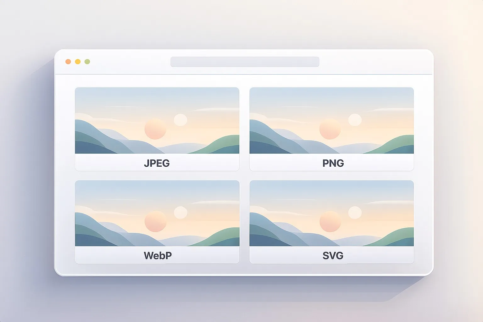
At this point, you’ve seen the full spectrum of how the web handles images. JPEG helps keep photos light. PNG keeps graphics crisp. WebP blends the best of both worlds with modern compression. And SVG steps outside the pixel grid entirely, offering infinite sharpness and flexibility.
Together, these formats form a toolkit rather than a competition. Each one shines in a different situation, and knowing the strengths of each makes choosing the right format feel natural instead of confusing. You now have a clear mental model for when to reach for each format and why.