The Simple Guide to Responsive Images (srcset and sizes)
A complete, practical guide to responsive images. From understanding `srcset` and `sizes` to generating all your image versions instantly with the Vayce Image Resizer.
Mon Oct 27 2025 • 5 min read

Most websites today use the same large image for every visitor. Whether they’re on a 4K monitor or a 5-inch phone. It looks fine on desktop but quietly drains performance everywhere else.
That’s where responsive images come in.
With a few extra HTML attributes, you can let the browser automatically select the best image file for each screen. The result: faster loads, happier visitors, and higher Core Web Vitals.
This guide explains how responsive images really work, how to use srcset and sizes, and how to generate all the different image versions instantly using the Vayce Image Resizer.
Why Responsive Images Exist
Before srcset and sizes, every image on the web was one-size-fits-all. Designers used big images “just in case” someone had a large screen. Mobile users ended up loading desktop-sized files, wasting bandwidth and time.
As internet speeds improved, so did expectations. Today, users expect a site to load in under 2 seconds. Google even uses image load speed to rank results.
Responsive images fix this by letting you provide multiple versions of an image at different sizes and formats, and letting the browser choose which one to download based on device width, pixel density, and layout.
Think of it like handing the browser a menu:
“Here are five versions of this photo. You pick whichever fits best on your screen.”
That flexibility is built right into HTML.
The Two Core Attributes: srcset and sizes
Responsive images rely on two attributes that work together:
srcset: The list of image candidates
This tells the browser which files exist and their widths:
<img
    src="photo-800.jpg"
    srcset="photo-400.jpg 400w, photo-800.jpg 800w, photo-1600.jpg 1600w"
    alt="A mountain landscape">
Each image has a width descriptor (400w, 800w, etc.). The browser uses this to understand your available image options.
sizes: The layout logic
sizes describes how wide the image will appear relative to the viewport.
<img
    src="photo-800.jpg"
    srcset="photo-400.jpg 400w, photo-800.jpg 800w, photo-1600.jpg 1600w"
    sizes="(max-width: 600px) 100vw, 50vw"
    alt="A mountain landscape">
This means:
- On screens ≤ 600px wide, the image takes up 100% of the viewport.
- Otherwise, it takes up 50% of the viewport width.
The browser combines both sets of data to decide which image file to use.
How Browsers Decide Which Image to Load
- The browser reads all the options in
srcset. - It looks at your CSS layout and
sizesrules. - It checks device pixel density (e.g., 2× for Retina displays).
- It picks the smallest image that will still look crisp in the rendered size.
This choice happens before the image is downloaded. That’s what makes it so efficient.
Using the <picture> Element for More Control
The <picture> element gives you even more flexibility, especially for modern formats like WebP, or when you want different crops per device.
<picture>
    <source type="image/avif" srcset="photo-400.avif 400w, photo-800.avif 800w">
    <source type="image/webp" srcset="photo-400.webp 400w, photo-800.webp 800w">
    <img src="photo-800.jpg" alt="Mountain lake" loading="lazy">
</picture>
If a browser supports AVIF, it will use that. If not, it falls back to WebP, and finally to JPEG. That gives you compression savings without breaking compatibility.
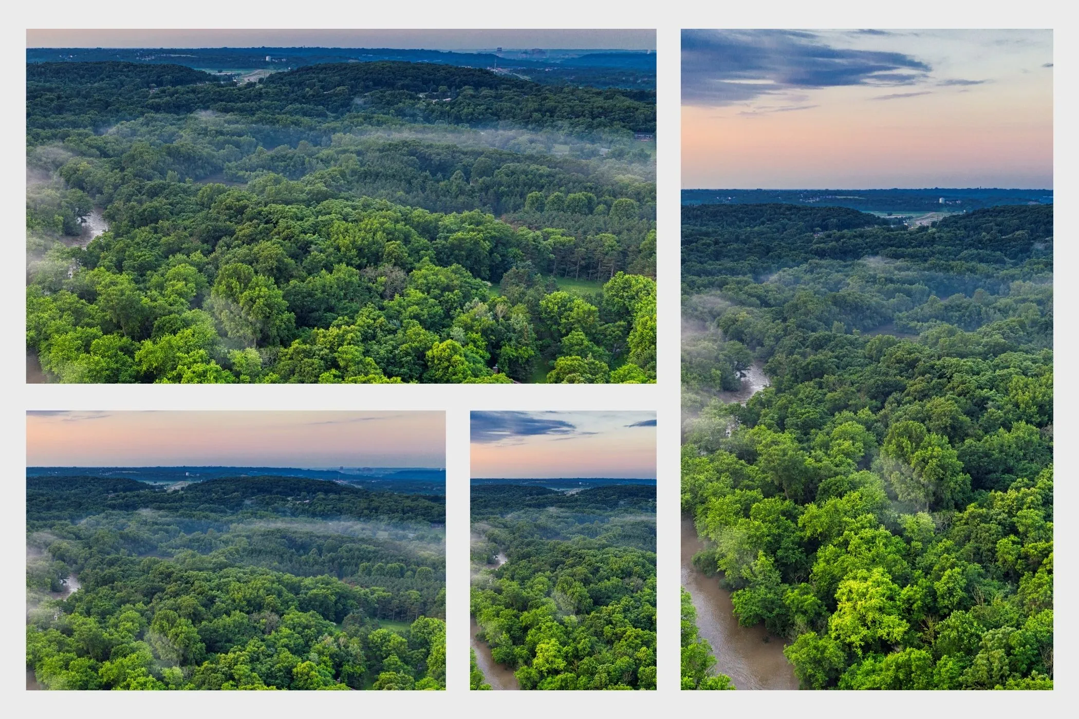
You can also use <picture> for art direction, changing image composition per screen:
<picture>
    <source media="(max-width: 600px)" srcset="photo-portrait.jpg">
    <img src="photo-landscape.jpg" alt="Different crops for different screens">
</picture>
This is perfect when a mobile crop needs to focus on the subject rather than showing the entire scene.
Testing Your Responsive Images
You can verify how browsers choose image files directly in Chrome DevTools:
- Open the page with your responsive image.
- Open Network → Img.
- Resize the browser window.
- Watch which image file gets requested at each breakpoint.
You can also simulate device pixel ratios under Rendering → Emulate device pixel ratio to test Retina and HD screens.
Tools like Lighthouse and WebPageTest can confirm the performance impact. You should see lower total bytes transferred and faster image paints.
How to Generate Responsive Image Sets Automatically
The technical part is easy. The hard part is preparing multiple versions of every image. That’s where the Vayce Image Resizer simplifies the process.
You can generate dozens of optimized image sizes in seconds:
- Drop in your images. Drag one or more JPG, PNG, or WebP files.
- Choose your mode:
- Fixed widths (
2000,1600,1200,800,400) - Scale percentages (200%, 100%, 50%)
- Fit inside a box (like
1200×800)
- Preview instantly. Each image shows its resized outputs.
- Download all as ZIP. Files are neatly named (
hero-1200x800.jpg,hero-800x533.jpg) - ready forsrcset.
Measuring the Real Impact
You can quantify responsive image benefits easily:
- Load time reduction: Measure total transferred bytes in DevTools before and after.
- Largest Contentful Paint (LCP): A smaller hero image directly improves this metric.
- SEO performance: Google’s PageSpeed Insights often recommends responsive images. After fixing them, you’ll see an immediate green boost.
Even a 500KB reduction per page can translate into seconds saved on slow networks.
Beyond Responsive Images: Progressive JPEGs as an Alternative
Responsive image markup isn’t the only way to make large visuals load faster. Another practical approach (especially for large hero images) is progressive JPEGs.
Progressive JPEGs don’t require multiple versions of the same image. Instead, they’re encoded in layers: the browser first loads a low-detail preview, then gradually fills in the sharper details as data arrives. The user perceives the image as loading almost instantly.
If your design doesn’t need several resolutions or you prefer a simpler setup, progressive JPEGs can be a great alternative to srcset and sizes. They work across all major browsers, reduce perceived load time, and keep your workflow light.
Explore the full guide: How to Speed Up Your Site Using Progressive JPEGs. It explains how progressive encoding works, why it feels faster, and how you can generate them directly in your browser using the Vayce Progressive JPEG Converter.
The Takeaway
Responsive images are one of the simplest and most rewarding web optimizations you can implement. They make your site faster and more efficient.
With tools like Vayce Image Resizer, generating every size variation becomes effortless. Combine it with the Image Compressor for the lightest possible files, or try progressive JPEGs for an even simpler approach.
