How to Choose the Right Image Shape for the Job
Every image lives somewhere: a product card, a hero, a feed, a story. Each space has its own rhythm. This guide explains which aspect ratios fit where, why they work, and how to crop them cleanly using the Vayce Image Cropper.
Wed Nov 05 2025 • 5 min read
When you design or publish online, you don’t really choose ratios, the web does it for you. Every slot, every container, every social platform quietly assumes a shape.
Choosing the right one isn’t just design taste; it’s about how a layout breathes. Does this image belong in a feed? On a homepage hero? In a tutorial? Each space has its own geometry. And when you crop with that in mind, your content simply fits better.
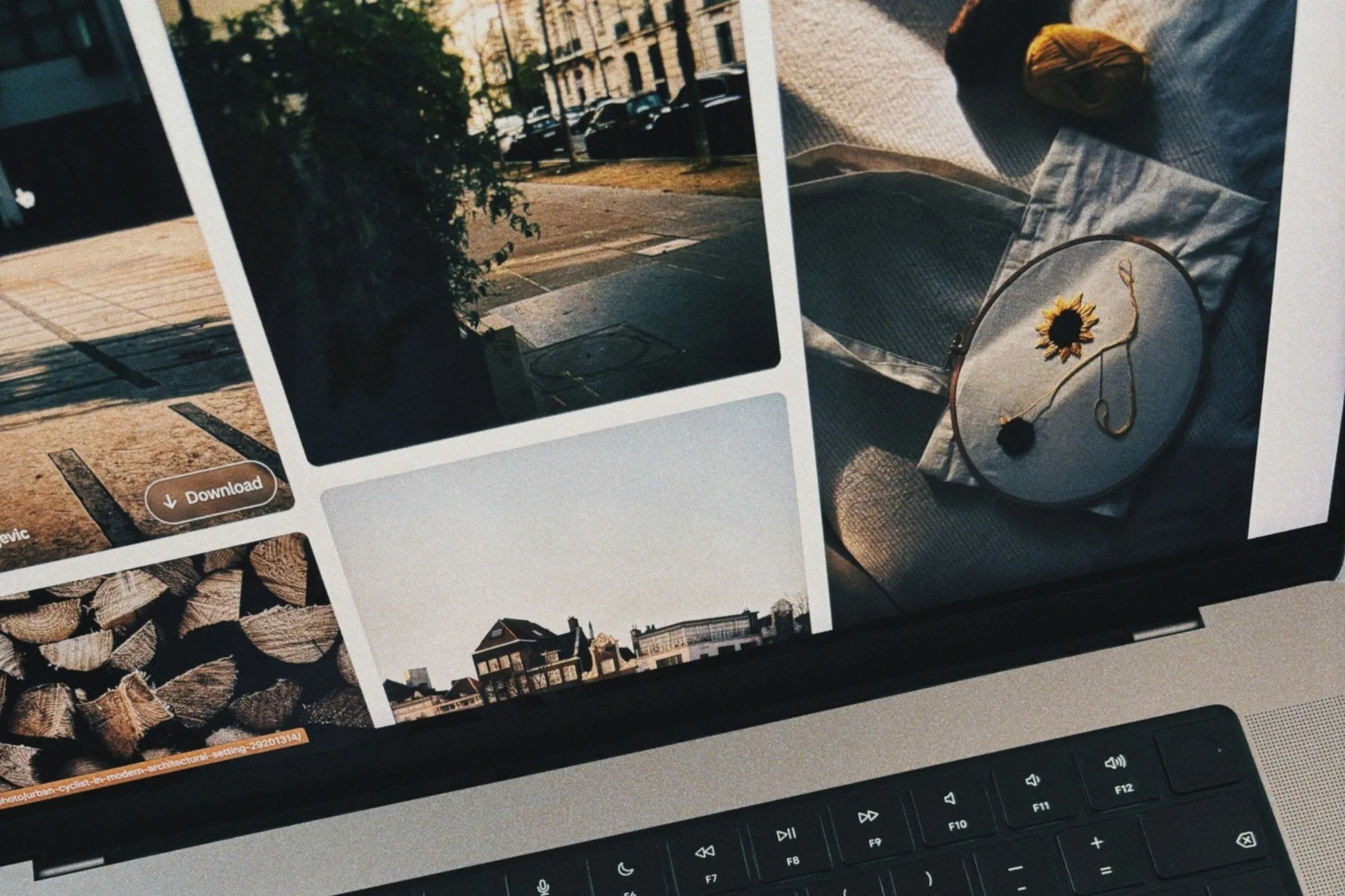
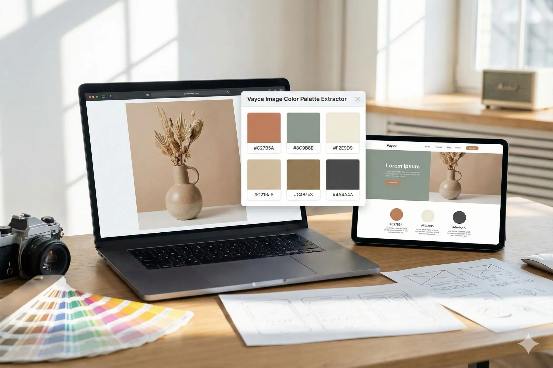
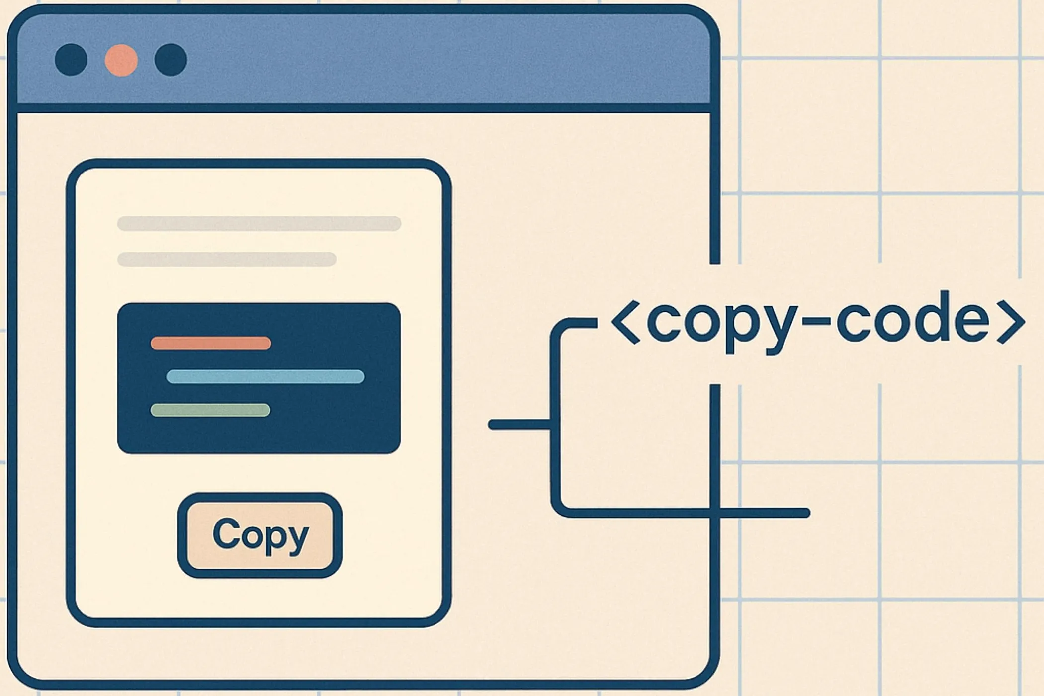
You can try every frame in the Image Cropper. Drop a single photo, switch through presets, and see how each one changes what the picture says.
For social feeds
Social feeds reward vertical attention. The taller your post, the more screen it occupies before a swipe. That’s why 4:5 is the dominant feed ratio. It shows more subject, more texture, and more reason to pause.
For consistency, keep a 1:1 square version for grid or profile views. Especially on Instagram, where the grid defines your brand tone. Squares bring balance; portraits bring focus. Use both, intentionally.
Avoid 16:9 in feeds; it looks like a banner ad and gets skipped.
For stories and vertical video (Instagram, TikTok, Shorts)
Stories are immersive by design. The only ratio that truly fits is 9:16 — the shape of a phone held upright. Anything else will letterbox or crop.
Because overlays eat into the top and bottom margins, keep key text and faces in the center third. Think of the screen like a stage: your content performs in the middle, not at the edges.
If your footage was shot horizontally, recrop it cleanly instead of rotating. The Image Cropper makes this painless.
For product cards and galleries
Product images are about trust. Users want to scan quickly, not interpret. That means uniform crops.
1:1 squares are the universal standard. They anchor e-commerce grids, making rows look even and reliable. Everything aligns, from tech listings to bakery menus.
If your products are tall (bottles, clothes, books) try 4:5 for a touch more breathing room. Just don’t mix shapes within a grid; asymmetry reads as sloppy.
Consistency matters more than creativity here.
For website heroes and banners
Heroes are your welcome mat. They should feel open, not heavy.
Most sites look best with 3:1 or 16:9 heroes. The wide ratio lets you pair image and text without overlap, keeping CTAs legible and layouts light.
Keep subjects centered and backgrounds clean. Banners are half design, half whitespace. If your image has action or depth, ensure it survives mobile cropping by keeping the focal point near the center third.
Tall formats like 4:5 or 9:16 overwhelm the viewport. Keep verticals for social.
For blog headers and feature images
Articles need images that feel part of the reading rhythm. They should mark a start, not dominate the scroll.
16:9 works almost everywhere: it’s screen-native and instantly familiar. 3:2 feels more photographic and a bit tighter. Both ratios scale gracefully across desktop and mobile.
Avoid tall crops like 4:5 or 9:16 here; they steal too much vertical real estate. And skip ultra-wide 21:9 unless the layout explicitly supports it.
For UI screenshots and tutorials
Screens have changed. The 4:3 crops that filled 2010s blog posts now feel boxed-in. Modern devices like MacBooks (16:10), Surface laptops (3:2) and Chromebooks favor taller displays with softer proportions.
If you’re documenting software or interfaces today, use 16:10 or 3:2. They mirror what users actually see and give text more legibility on high-density screens.
Keep padding generous. A screenshot shouldn’t look like evidence, it should look like an example.
For Pinterest, infographics, and vertical storytelling
Pinterest doesn’t show time; it shows height. The taller the image, the longer it holds attention, which is why 2:3 is its native rhythm.
It’s ideal for recipes, posters, and any graphic meant to scroll vertically. 2:3 feels natural in the hand and readable on mobile.
If you’re adapting a horizontal design for Pinterest, don’t just stretch it. Crop vertically, simplify the composition, and center key text. For print, 2:3 also maps neatly to common photo and poster dimensions (4×6, 8×12).
For cinematic pages and background visuals
When you want width to feel like scale, go 21:9. It’s the ratio of movie screens. Perfect for product launches, creative portfolios, or ambient looping videos.
But mobile will never show it as intended. Always provide a 16:9 fallback, and never rely on edge details. Ultra-wide images should suggest mood, not contain meaning.
How to test all of this quickly
Start with one main image. Open it in the Image Cropper, switch through presets, and watch how the story shifts: the same subject feels close in 4:5, open in 16:9, cinematic in 21:9.
When you’re happy, download the crops you’ll actually use. Then resize for responsive breakpoints with the Image Resizer and trim file size with the Image Compressor. All three tools run locally, so nothing leaves your browser.
Final thought
Every shape carries intent. Square means order. Portrait means intimacy. Landscape means space. Ultra-wide means drama.
Pick the one that serves the content not the other way around.