What this tool does
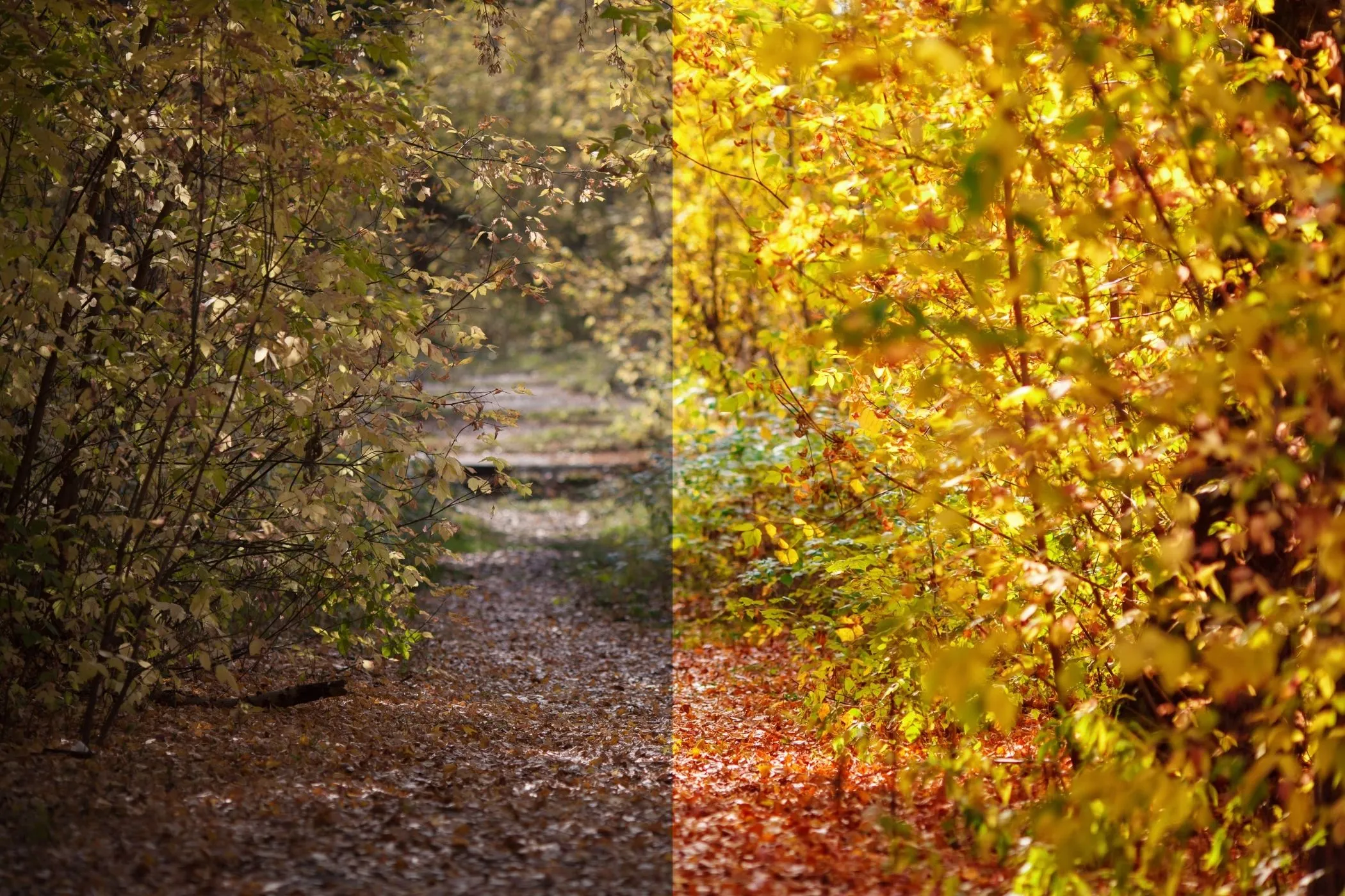
Tint / Color Grade applies a single, solid color overlay to your photo and blends it using professional blend modes (Multiply, Screen, Overlay, Soft Light, etc.). This is one of the fastest ways to give an image a cinematic palette, unify a series of photos, or create a strong “brand color” mood.
Unlike basic “colorize” filters, this tool gives you:
- Custom tint color (choose any hex color)
- Blend mode control (how the tint interacts with the photo)
- Tint strength (how strong the grade feels)
- Input adjustments (Saturation, Contrast, Invert) to shape the base image before the tint is applied
- Surprise Me random looks you can refine
Everything is processed locally on your device.
Workflow
-
Upload one image
Drag & drop, click to select, or paste from clipboard (Ctrl/⌘+V). EXIF orientation is respected. -
Pick a tint color
Use the color picker or type a hex code (example:#ffcc88). -
Choose a blend mode
Start with Multiply (moody), Screen (bright), or Soft Light (film-like). -
Dial in Strength
Strength controls how much of the tint layer is blended into the photo. -
Tune the base image (optional but powerful)
Adjust Saturation and Contrast, or enable Invert for negative/abstract effects. -
Download
Export in the same format you uploaded (JPEG stays JPEG, etc.).
What is “tinting” in photo editing?
A tint is a controlled color cast applied across an image to shift its mood. In real-world photography, tints come from:
- Lighting temperature (warm tungsten vs cool shade)
- Film stock characteristics (greens, magentas, deep blues)
- Chemical processes (cyanotypes, sepia toning)
- Printing & scanning workflows (paper, ink, and scanner profiles)
Digital tinting recreates these looks by blending a color layer with the underlying pixels.
Blend modes explained (in plain English)
Blend modes decide how the tint interacts with brightness.
Multiply (Darken)
- Think: ink on paper
- Makes shadows richer and pushes mood darker
- Great for: cinematic, street photography, gritty edits
Screen (Lighten)
- Think: projector light
- Lifts shadows and brightens the image overall
- Great for: dreamy highlights, pastel looks, “washed” film vibes
Overlay (Contrast)
- Increases contrast while tinting
- Strong, punchy grades
- Great for: posters, bold social content
Soft Light (Subtle)
- Like Overlay but gentler and more “photographic”
- Great for: portraits, lifestyle, subtle film looks
Hard Light (Harsh)
- High-impact, dramatic contrast
- Great for: graphic looks, intense stylization
Color (Hue + Saturation)
- Applies the tint’s color but keeps the photo’s brightness
- Great for: clean recoloring, unified brand palette without crushing contrast
Luminosity
- Applies brightness from the tint layer (special-case looks)
- Can create surprising “B&W + grade” behaviors depending on settings
Difference
- Produces inverted/psychedelic color interactions
- Great for: abstract art, album covers, experimental graphics
Controls (what each one really does)
Tint Color
Pick the grading color. If you want classic looks:
- Warm film: oranges/amber (
#ffcc88,#f2b279) - Cool cinematic: teal/blue (
#2bb3b1,#2d6cdf) - Vintage green: olive (
#7a8f5a) - Magenta cast: (
#c04aa5)
Strength (0–100%)
Controls opacity of the tint layer.
- 10–30%: subtle color temperature shift
- 40–70%: obvious grading
- 80–100%: bold stylization / poster-like
Saturation (0–200%)
Adjusts the image before tinting.
- 0%: removes color → lets tint act like a classic chemical tone
- 80–120%: normal grading range
- 140–200%: vibrant, pop-art looks
Contrast (50–150%)
Also applied before tinting.
- Lower contrast: softer, hazier grade
- Higher contrast: punchier, more “printed” look
Invert Input
Inverts the base image before tinting.
- Great for experimental aesthetics
- Combine with Difference for wild results
Best-use cases
- Cinematic color grading for thumbnails, YouTube stills, and social posts
- Brand consistency (make different photos feel like one set)
- Album cover looks (Difference/Hard Light with strong colors)
- Cyanotype / monotone vibes (Saturation 0% + blue tint)
- Mood boards (quickly explore palettes on the same photo)
- UI/hero backgrounds (create subtle tinted backdrops)
Presets you can recreate (quick recipes)
1. Teal & Orange (cinematic)
- Blend: Soft Light or Overlay
- Tint: teal (
#2bb3b1) - Strength: 25–45%
- Saturation: 95–115%
- Contrast: 105–125%
2. Warm film wash
- Blend: Screen
- Tint: warm amber (
#ffcc88) - Strength: 20–40%
- Contrast: 90–105%
3. Sepia‑ish toning (without full sepia)
- Blend: Multiply
- Tint: brown/orange (
#b07a3a) - Strength: 30–60%
- Saturation: 70–100%
4. Cyanotype / blueprint
- Saturation: 0%
- Blend: Color or Multiply
- Tint: deep blue (
#1e4ed8) - Strength: 35–70%
5. Poster pop
- Blend: Hard Light
- Tint: bright color (try Surprise Me)
- Strength: 60–100%
- Saturation: 120–180%
- Contrast: 120–150%
Tips for natural-looking grades
- Start low, then build. Many “pro” grades sit around 15–45% strength.
- Use Soft Light when unsure. It’s the most forgiving blend mode for photos.
- Control saturation first. Over‑saturated bases can make tinting look cheap.
- Add contrast carefully. Too much contrast + Multiply can crush shadows.
- Pick colors with intent. Warm colors feel nostalgic; cool colors feel modern and dramatic.
Troubleshooting
“My image looks muddy / too dark.”
- Lower Strength
- Switch from Multiply → Soft Light
- Reduce Contrast or increase Saturation slightly
“The tint looks neon / unrealistic.”
- Reduce Saturation to 80–100%
- Use Soft Light instead of Overlay/Hard Light
“I want the tint to affect shadows more than highlights.”
- Use Multiply (naturally targets darker regions)
“I want highlights to glow.”
- Use Screen and keep Strength modest (15–35%)
How it works (technical but readable)
This tool uses the browser’s Canvas pipeline:
- Your image is decoded locally via
createImageBitmap()with EXIF orientation applied. - Optional pre-filters are applied (Invert, Saturation, Contrast).
- The tool draws a full-canvas rectangle in your chosen tint color, blended using
globalCompositeOperation(Multiply/Screen/Overlay/etc.) and your Strength asglobalAlpha. - Export is generated client-side in your original file type.
No uploads. No server processing.
Privacy & offline
- Privacy-first: Your image never leaves your device.
- Offline-ready: After the tool page loads once, it can run offline (especially when installed as a PWA).
- Fast previews: Rendering is capped internally for responsiveness, while export is full resolution.