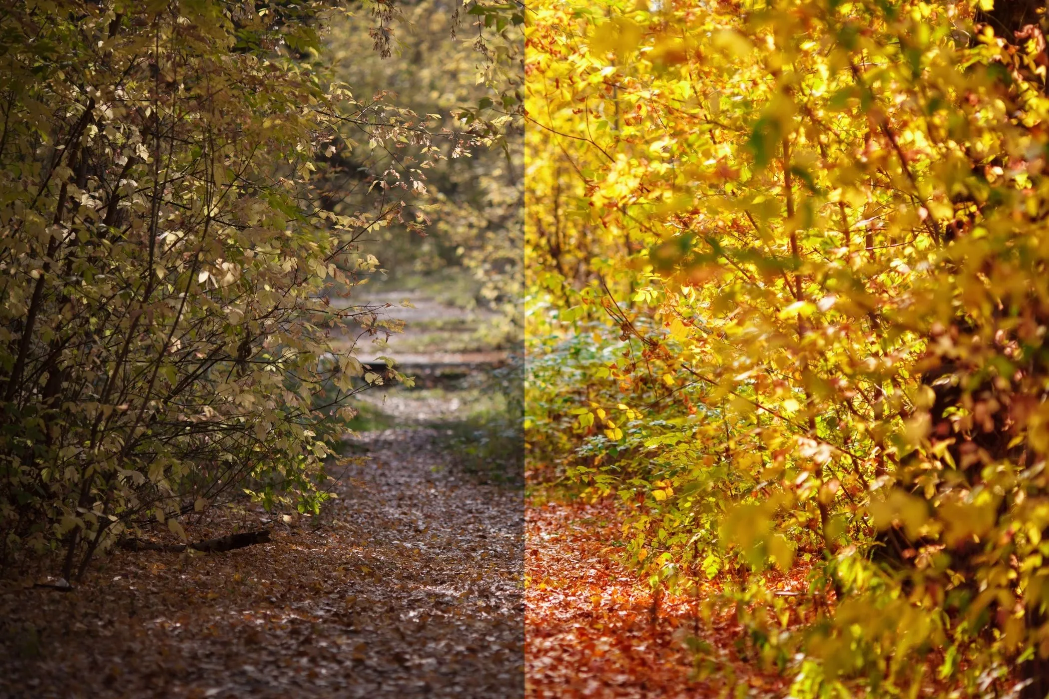
Shadows & Highlights in One Sentence
Fix uneven lighting by lifting shadows and recovering highlights with control over how wide the effect spreads, how locally it adapts, and how natural it looks — then blend with Mix and export at full resolution.
When to Use Shadows & Highlights
This tool is perfect when a photo has detail you can’t see at one end of the tonal range:
- Dark shadows (interiors, backlit portraits, night shots)
- Blown or harsh highlights (skies, white clothing, shiny products)
- A scene with bright windows and dark corners
- Photos that look “almost right” but need targeted recovery, not a global exposure change
It’s especially useful for:
- travel and landscape photos
- interiors / real estate
- product photos on light backgrounds
- portraits (gentle shadow lift)
Everything is processed locally in your browser — no uploads.
Recommended Workflow
1. Start with small adjustments
- Increase Shadows slightly to reveal detail.
- Increase Highlights (recovery) slightly if bright areas are harsh.
2. Set Tonal Width
- Narrow width = affects only the deepest shadows / brightest highlights.
- Wider width = reaches more into midtones.
If your image starts to look “flat,” reduce width rather than reducing the main sliders.
3. Tune Radius for natural detail
- Lower Radius = more local, detail-preserving (can look punchy)
- Higher Radius = smoother, more global (can look more natural)
4. Add Midtone Contrast (optional)
Shadow/highlight recovery can reduce perceived contrast. Use Midtone Contrast to restore clarity without re-crushing the extremes.
5. Preserve Color + Mix
- Enable Preserve Color for stable hues (recommended for most photos)
- Use Mix to keep the result realistic
Controls Explained (Practical)
Shadows
Lifts or darkens shadow detail.
- > 100 = lift shadows (reveal detail)
- < 100 = deepen shadows (more drama)
Highlights
Recovers or boosts highlights.
- > 100 = recover highlights (reduce harsh whites)
- < 100 = boost highlights (brighter, punchier)
Tonal Width (Shadows)
How much of the tonal range counts as “shadow.”
- Narrow: mostly deep shadows
- Wide: shadows + some midtones
Tonal Width (Highlights)
How much of the tonal range counts as “highlight.”
- Narrow: only the brightest areas
- Wide: highlights + some midtones
Radius
Controls local adaptation (how smooth the recovery is across edges).
- Small radius: protects small details, can look stronger
- Large radius: smoother transitions, often more natural
The tool automatically scales Radius with image size so it behaves consistently on small and large images.
Midtone Contrast
Restores midtone “pop” after recovery.
- > 100 = more midtone separation
- < 100 = softer, flatter midtones
Preserve Color
Keeps hue/saturation stable while changing brightness.
- Recommended for portraits and colorful images
- If you want a more stylized look, try turning it off
Mix
Blends the corrected image with the original.
- 70–95% is usually the sweet spot
- Use Mix as your “naturalness” control
Surprise Me ✨
Surprise Me generates pleasing, photo-like starting points such as:
- clean shadow lift + mild highlight recovery
- highlight recovery for bright scenes
- matte-ish lift for low-contrast images
- moody detail (stronger highlight recovery + midtone contrast)
It uses quick brightness analysis so it tends to lift darker images more and protect bright images more — and it adds small jitter so results don’t feel repetitive.
Quick Recipes
1. Interior photo (dark corners + bright windows)
- Shadows: +10 to +35
- Highlights: +10 to +35
- Width (Shadows): medium
- Width (Highlights): medium
- Radius: medium/high
- Preserve Color: on
- Mix: 70–90%
2. Sky recovery (avoid blown whites)
- Highlights: +20 to +60
- Width (Highlights): narrow to medium
- Radius: medium
- Midtone Contrast: +5 to +20
- Mix: 70–95%
3. Portrait lift (natural skin)
- Shadows: +10 to +25
- Highlights: +5 to +20
- Radius: medium/high
- Preserve Color: on
- Mix: 75–95%
4. Product photo on white background
- Highlights: +10 to +40 (recovery)
- Width (Highlights): narrow
- Midtone Contrast: +10 to +30
- Mix: 70–90%
5. Moodier look (more depth)
- Shadows: -5 to -20
- Highlights: +10 to +35
- Midtone Contrast: +15 to +40
- Mix: 60–85%
Best Practices
Make small moves first
Overdoing shadows can make images look gray or noisy. Start subtle.
Use Tonal Width to avoid “flat” results
If recovery affects too much of the image, reduce width.
Radius controls realism
If edges look crunchy/haloed, increase Radius or reduce the main amounts.
Preserve Color for portraits
Shadow lifting can shift saturation. Preserve Color keeps skin tones stable.
Use Mix instead of fighting the sliders
If the correction is right but a bit too strong, lower Mix.
Common Problems and Fixes
“It looks flat / gray.”
- Reduce Tonal Width (Shadows/Highlights)
- Increase Midtone Contrast slightly
- Lower Mix
“I see halos around edges.”
- Increase Radius
- Reduce Shadows/Highlights amount
- Narrow Tonal Width
“Shadows look noisy after lifting.”
- Reduce Shadows amount
- Narrow Tonal Width (Shadows)
- Increase Radius a bit (smoother adaptation)
- Lower Mix
“Highlights still look harsh.”
- Increase Highlights recovery
- Narrow Tonal Width (Highlights) to focus on the brightest areas
“Colors look off after adjustment.”
- Enable Preserve Color
- Reduce amounts and use Mix to keep it natural
How It Works
Shadows & Highlights uses local luminance to decide what to lift or recover:
- Build a luminance map (brightness map) from the image
- Apply a controllable local blur (Radius) to create a smooth “local exposure” reference
- Create separate masks for:
- shadows (dark areas)
- highlights (bright areas) Tonal Width controls how wide these masks extend into midtones
- Adjust brightness in those regions, optionally restoring midtone contrast
- Preserve hue/saturation (Preserve Color) by scaling RGB to match the new luminance
- Blend with the original using Mix
Preview renders with a size cap for speed, while Download exports at full resolution in the original format.