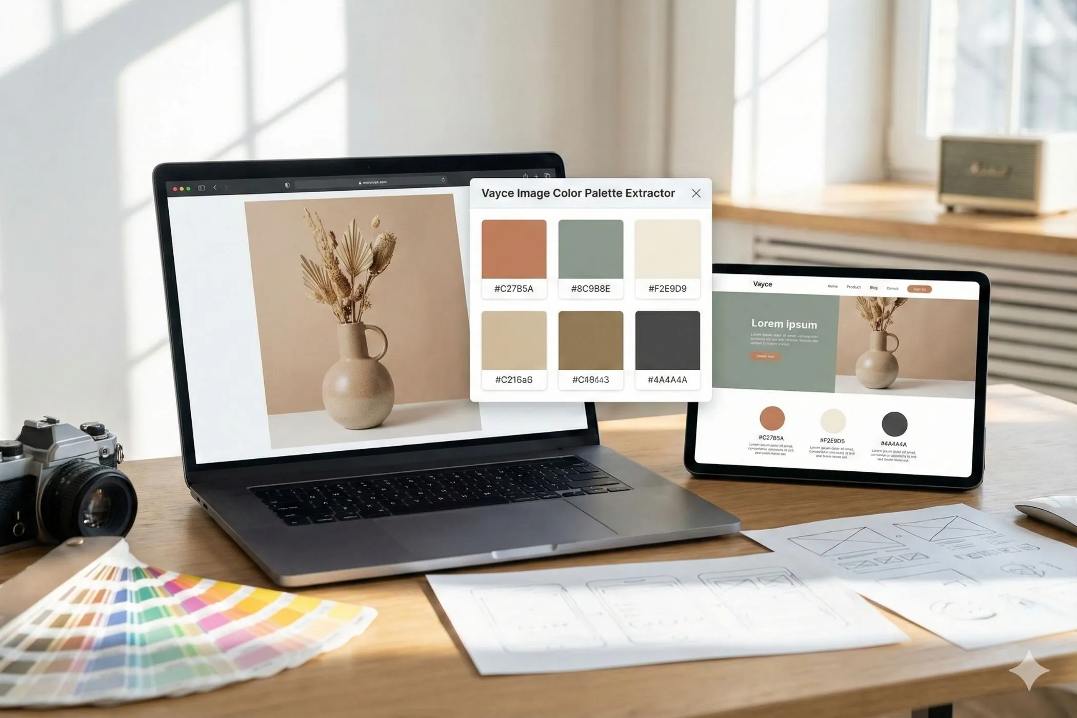
Color palettes that feel cohesive
This tool generates harmonious color palettes using classic color theory modes (Analogous, Monochromatic, Triad, Complementary, Split Complementary) — with practical controls for intensity, brightness, and variation, plus one-button export for real projects.
What you can create with a palette generator
Use it for:
- UI themes (backgrounds, surfaces, text, accents)
- Brand palettes (primary + supporting colors)
- Landing pages & marketing (hero gradients, button sets)
- Charts & data viz (distinct series colors with balanced contrast)
- Illustrations & icons (cohesive sets without muddy mixes)
- Design tokens (export CSS variables and reuse everywhere)
Workflow
1. Choose a harmony mode
Pick the structure that fits your goal:
- Analogous: smooth, modern palettes that feel “safe” and cohesive
- Monochromatic: a single hue with controlled lightness shifts (great for UI)
- Triad: energetic, playful palettes with strong variety
- Complementary: high contrast pairs (perfect for primary + accent)
- Split Complementary: contrast with less harshness than pure complementary
- Random: broad exploration, still shaped by your settings
2. Generate and refine (keyboard-friendly)
- Generate → fresh palette guided by your selected harmony (Space)
- Refine → keep the vibe and improve harmony without a full reset (Shift+Space)
3. Lock what you love
Click the lock icon on any swatch to keep it.
This is the fastest real-world workflow:
- generate until one color feels right
- lock it
- generate/refine until the set snaps into place
4. Export
- Copy CSS Variables → paste into your app or design tokens
- Copy HEX List → paste into docs, Figma, Tailwind config, or notes
- Click any swatch HEX to copy instantly
Understanding the controls (practical, not theoretical)
Count (3–8)
How many swatches you want.
- 3–4: minimalist UIs, small brand sets, hero palettes
- 5: sweet spot for most use cases
- 6–8: richer systems, charts, multi-accent design
Strictness (0–100%)
How strongly the palette follows the harmony rule.
- 80–100: very cohesive, “designed on purpose”
- 45–75: still harmonious, with more surprise
- 0–40: loose, exploratory, more unexpected combos
Chaos (0–60°)
Adds hue deviations for a more organic feel.
- 0–8°: clean, controlled, design-system friendly
- 10–25°: lively and natural (great for brands)
- 30–60°: wild exploration (use Refine to pull it back)
Base Color (Seed Hue)
Sets the hue “starting point” for the palette.
- Use it when you want palettes that stay in a specific color family (e.g., brand blue, product green, seasonal red).
- Switch it to Random for wide exploration.
- If you lock a swatch, the locked color becomes the anchor (highest priority), even if Base Color is set.
Intensity (Saturation target + variation)
This controls how vivid colors are.
- Saturation 60–85: modern, vibrant palettes
- Saturation 25–55: muted, premium, “editorial” palettes
- Use Variation to avoid flat sameness:
- 8–16: consistent and usable
- 18–30: more personality
Brightness (Lightness target + variation)
This controls how “light” or “dark” the palette tends to be.
- Lightness 45–60: versatile default range
- Lightness 25–40: dark themes and moody palettes
- Lightness 65–80: soft, airy palettes (pastels)
Tip: For UI work, brightness matters more than you think — it decides whether colors can become backgrounds, surfaces, or only accents.
Quick recipes (copy these settings)
Use these as starting points and then hit Generate → Refine a few times.
Clean modern UI (safe + cohesive)
- Mode: Analogous
- Count: 5
- Strictness: 85–100
- Chaos: 3–8°
- Intensity: 55–75, Variation 10–16
- Brightness: 48–58, Variation 12–18
Pastel brand palette (soft + friendly)
- Mode: Analogous or Split Complementary
- Strictness: 70–90
- Chaos: 6–14°
- Intensity: 25–45, Variation 8–18
- Brightness: 68–78, Variation 10–18
Bold product palette (high energy)
- Mode: Triad
- Count: 5–6
- Strictness: 70–90
- Chaos: 8–18°
- Intensity: 70–95, Variation 12–22
- Brightness: 45–60, Variation 14–22
Dark UI with a pop accent
- Mode: Complementary or Split Complementary
- Count: 4–5
- Strictness: 85–100
- Chaos: 0–8°
- Intensity: 55–85, Variation 10–18
- Brightness: 28–40, Variation 10–16
Workflow: lock the best accent color, then Refine until backgrounds feel usable.
Earthy / muted / premium
- Mode: Analogous
- Strictness: 70–95
- Chaos: 6–16°
- Intensity: 20–45, Variation 8–18
- Brightness: 40–58, Variation 12–20
Real-world tips for palettes that ship
- Lock early. If one swatch feels right (brand color, product color, hero color), lock it and build around it.
- Use Refine more than Generate once you’re close. Refine keeps the direction and improves coherence.
- Aim for roles, not just colors. In a UI, you usually need:
- 1 primary
- 1 accent
- 1–2 neutrals / surfaces
- 1 background-ish option
- Watch readability. The palette preview automatically chooses a readable text color per swatch (black/white) so you can quickly spot colors that will fight with text.
Export options
Copy CSS Variables
Exports a ready-to-use snippet:
:root {
  --color-1: #2691D9;
  --color-2: #264CD9;
  --color-3: #5E26D9;
  --color-4: #26D9B2;
  --color-5: #26D96C;
}
Perfect for:
- design tokens
- theming systems
- quick prototypes
- component libraries
Copy HEX List
Copies each HEX value on its own line — easy for docs, Figma styles, notes, or Tailwind config.
How this palette generator works
Under the hood, the tool generates swatches in HSL (Hue, Saturation, Lightness), then converts to HEX for copying/export.
-
Pick an anchor hue
- If any swatch is locked, the generator uses that swatch’s hue as the anchor.
- Otherwise, if Base Color (seed hue) is set, it uses that hue.
- Otherwise it chooses a random hue.
-
Build harmony target hues Based on your mode (analogous/triad/complementary/etc.), it computes a set of target hues.
-
Blend structure + randomness Strictness decides how strongly hues are pulled toward harmony targets. Chaos adds jitter so palettes don’t feel identical.
-
Apply intensity + brightness ranges Saturation and lightness are sampled around your targets, with variation.
-
Refine keeps the vibe Refine starts from the current hues and nudges them toward better harmony, instead of fully re-rolling everything.
Troubleshooting
“My palettes are too random.”
- Increase Strictness and reduce Chaos.
- Use Refine more than Generate.
“Everything is too neon.”
- Lower Intensity (saturation) and reduce saturation variation.
“Everything feels washed out.”
- Increase Intensity, or lower Brightness slightly.
“I can’t get usable UI backgrounds.”
- Lower Brightness target and reduce variation.
- Try Monochromatic for a ready-made UI scale.
“I want higher contrast accents.”
- Use Complementary or Split Complementary, and lock your favorite accent swatch.
“I want palettes around my brand color.”
- Set Base Color (seed hue) near your brand hue, then use Refine a few times.
- Lock your best swatch to make it the anchor and keep generating around it.
Perfect for
- Designers creating brand systems and moodboards
- Developers building theme tokens and UI palettes
- Makers prototyping landing pages fast
- Content creators who want consistent colors across thumbnails, pins, and graphics
Generate, lock, refine, export — and you’re done.