The Duotone Effect: What It Is, and How Two Colors Can Transform Any Image
Learn what the duotone effect is, how it works, and why using two simple colors can instantly transform busy photos into clean, consistent visuals that improve readability and elevate your website design.
Mon Nov 24 2025 • 5 min read
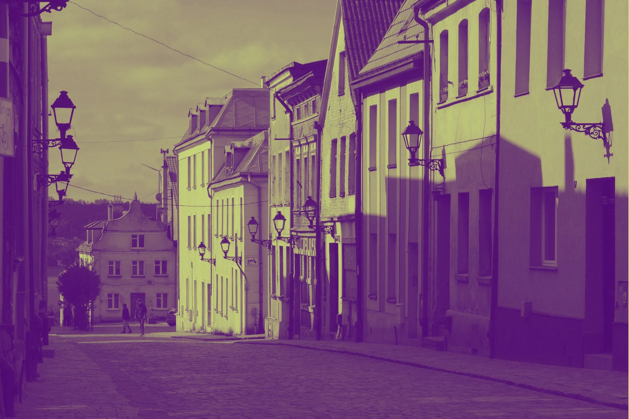
If you’ve ever dropped a photo into a layout only to watch it drown your headline, distort your palette, or overpower the entire section, you’ve already run into the exact problem duotone was made to solve.
The duotone effect takes any full-color image and remaps its entire palette to just two colors. That’s it: shadows get one color, highlights get another, and everything else blends between them. With a single move, the image shifts from visually noisy to intentional, calmer, and fully aligned with your design system.
This idea isn’t new. Designers used duotone long before the web existed. In the 1960s and ’70s, it became a popular print technique for posters, magazines, and album covers—partly for aesthetics, partly because full-color ink was expensive. The effect resurfaced in the digital era when software like Photoshop made it easy to stylize photos. Then it returned to the spotlight when brands like Spotify revived bold duotone campaigns in the mid-2010s. Their message was clear: even wildly different images can feel unified when they share the same two colors.
So, What Is the Duotone Effect?
Think of duotone as a complete color swap, not just a tint.
You choose two colors:
- one for the dark areas
- one for the light areas
Everything in between becomes a smooth gradient between these two tones. The shapes and details remain, but the mood changes entirely. It’s like putting a simple, stylish color lens over the world—suddenly the photo feels curated.
How It Works
Even though the result looks artistic, the process is surprisingly simple.
- Convert to grayscale: The tool removes all original color.
- Use brightness as a guide: Dark pixels lean toward one color; bright pixels toward the other.
- Blend the mid-tones: Everything in between stretches smoothly between the two hues.
You choose the colors, and the filter handles the rest. No masking, no layering, no complicated editing—just a clean, graphic transformation.
Why Duotone Works So Well on the Modern Web
The web is visual—but it’s also text-first. Full-color photos often look great on their own but become problematic when placed behind headings or UI elements. They fight for attention, create low contrast, and clash with brand colors.
Duotone fixes this by simplifying the palette. When an image uses only two colors you chose, it becomes a team player—not a bully. Text becomes more readable. Sections feel connected. Even average photos look more polished and “on brand.”
This is why duotone shows up in hero sections, landing pages, editorial layouts, marketing pages, and social graphics. It gives designers control without sacrificing mood.
A Designer’s Perspective
The magic of duotone is that it makes images behave. Instead of overpowering your layout, the image quietly supports it. Headlines look sharper. Buttons stand out. The entire section feels more composed.
It’s also incredibly efficient. Change the two colors once, and suddenly dozens of images—from stock photos to product shots—feel like they belong together. You get a unified system without hours of manual editing.
Where Duotone Shines
Use duotone when the image is meant to set mood, not deliver crisp detail.
- Big hero sections on landing pages
- Blog headers and thumbnails
- Social media graphics
- Email banners and feature highlights
- Section backgrounds that need to stay subtle
If the image’s job is “support the design,” not “carry the design,” duotone is almost always the better choice.
Creating a Duotone Image (The Easy Way)
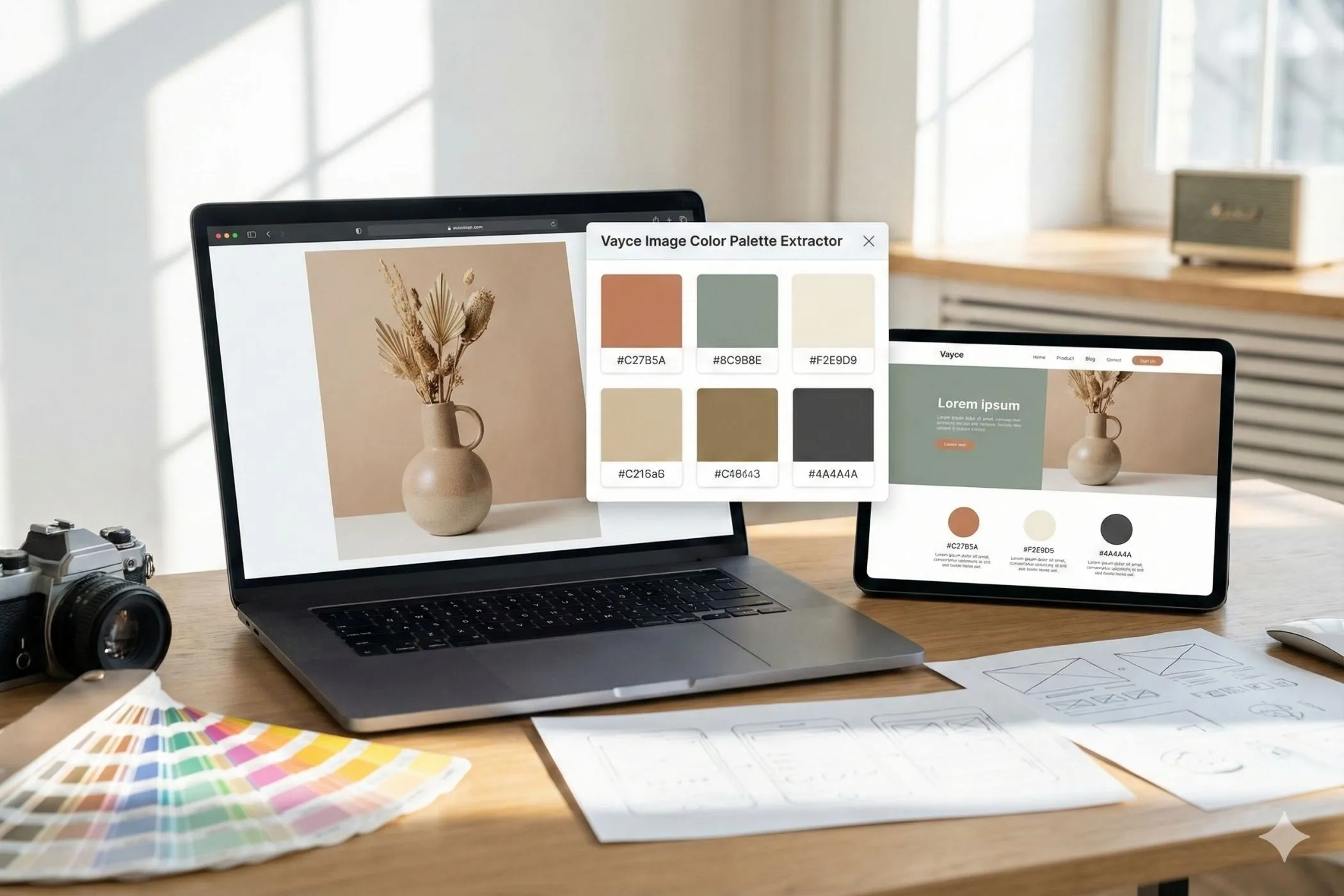
You don’t need Photoshop or any heavy software. Tools like the Vayce Duotone Effect Tool let you create the effect in seconds.
- Upload your image.
- Pick your dark color.
- Pick your light color.
- Adjust intensity if needed.
- Export.
That’s it. It’s one of the fastest ways to give a layout a completely new personality.
Real-World Examples
You’ll see duotone everywhere once you start looking.
- Streaming platforms use it for promotional banners.
- Music apps use it to create consistent artist or playlist covers.
- Editorial sites use duotone for category pages and section headers.
- Brands use it to unify campaign imagery across print and digital.
And on smaller sites, it often appears in hero images, onboarding flows, event pages, and splash screens. Anywhere mood matters, duotone steps in.
Choosing Color Pairs
A good pair usually includes a dominant color (mood) and a supporting color (structure). If you have brand colors, use the bolder one for highlights and a darker complementary color for shadows.
Don’t be afraid of unexpected combinations: deep teal with apricot, muted violet with warm taupe, dusty blue with sand. Because the palette is limited to two, even unusual pairs feel cohesive.
Each pair creates a different atmosphere:
- Warm tones (red, orange) bring energy.
- Cool tones (blue, teal) bring calm.
- Neutrals (gray, beige) keep things quiet.
Final Thoughts
Duotone isn’t just an aesthetic trend—it’s a genuinely useful tool. It keeps your design clean, makes your typography readable, and turns inconsistent photos into a unified system. With two thoughtful colors, you can transform almost any image into a professional-grade visual that elevates your entire layout.
And the best part? You can experiment with it right in your browser, anytime you need a quick burst of clarity or style.
