Web Image Formats Explained (Complete Series)
A four‑part guide that explains the core image formats used across the web — how they work, why they exist, and how to choose the right one for clarity, performance, and flexibility.
Fri Nov 21 2025 • 3 min read
Images are everywhere on the web, but most of us don’t think about the formats behind them — until a page feels too heavy, a logo looks blurry, or a background doesn’t blend the way we expected.
This series exists to remove that confusion. Each article explains one format clearly: how it works, why it was designed the way it was, and when it should (or shouldn’t) be used.
By the end, choosing the right format becomes a simple part of your workflow instead of a guessing game.
The Idea Behind This Series
Each image format was created to solve a specific problem on the web.
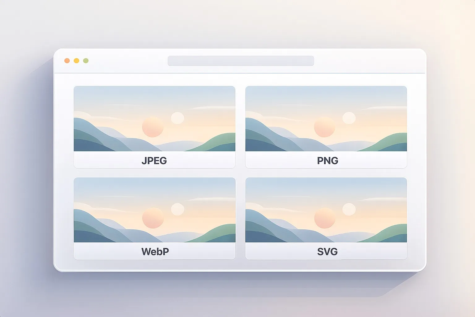
JPEG focuses on compressing photographs efficiently. PNG preserves pixel-perfect clarity and transparency. WebP aims to combine small file sizes with modern features. SVG takes a completely different approach and represents images as scalable shapes instead of pixels.
Understanding these roles is far more practical than memorizing technical charts. Once you know what each format is designed to handle, choosing the right one becomes straightforward.
You can read this page as a quick overview or explore each article in turn, depending on the images you’re working with.
JPEG — The Standard Format for Photos
We start with JPEG, the format that has powered web photography for more than 30 years. You’ll learn why it became the default, how its compression actually works, and why progressive JPEGs feel faster.
PNG — The Format That Keeps Things Crisp
Next, we explore PNG, born as an open alternative to GIF and designed for perfect clarity. This part explains lossless compression, transparency, and why PNG is unbeatable for icons, logos, screenshots, and UI elements.
WebP — The Modern All‑Rounder Solution
Then we step into WebP, Google’s attempt to modernize how images work online. You’ll see how it balances lossy and lossless compression, how it borrows ideas from video codecs, and where it shines (or struggles) in practical workflows.
SVG — Infinite Sharpness Without Pixels
Finally, we explore SVG, the only major format that isn’t built from pixels at all. This part shows why the W3C created it, how it stores shapes instead of color data, and why it’s the best choice for scalable graphics.
How to Use This Series
You can read all four parts in order for a complete understanding, or you can use this page as a reference.
If you’re dealing with photos → start with JPEG or WebP. If your design needs crisp edges or strong transparency → jump to PNG. If your graphics need to scale cleanly across devices → explore SVG.
The series is designed to make these choices feel natural — so you can focus on creating, not troubleshooting.
Wherever you begin, each article stands on its own. Start with whatever matches the images you’re working with today.