All About Web Components
Web Components are the browser’s built-in component model: Custom Elements, Shadow DOM, and slots. They let you define your own HTML tags, encapsulate markup and styles, and build reusable widgets that feel native. This guide walks through how they work, why they exist, and how to build reliable components that drop cleanly into any page.
Sun Nov 16 2025 • 30 min read
Most of the web is still built from a small set of native tags: <div>, <span>, <button>, <input>. When you need something more purposeful—a copy-to-clipboard widget, a dismissible alert, a tabbed panel—you usually end up stitching together markup, classes, and JavaScript on top of those primitives.
Web Components offer a different path: you can teach the browser new elements of its own. Using Custom Elements, the Shadow DOM, and slots/templates, you can build reusable widgets that come with their own markup, styles, and behavior—then drop them into any page with a single HTML tag.
In this guide, we’ll treat Custom Elements as the core of Web Components and show how the Shadow DOM and slots fit naturally around them. We’ll walk through the lifecycle, attributes vs properties, events, styling, accessibility, and a full copy-code example so you can see how everything connects.
By the end, “Web Components” won’t just be a spec—you’ll know how to use them to build elements that feel as natural and durable as something the browser could have shipped itself.
What Are Custom Elements?
A Custom Element is a way to teach the browser a new HTML tag.
Not a pattern. Not a framework feature. A real element — just like <button>, <input>, or <video>.
When you define one, the browser learns how to:
- create it,
- upgrade it when it appears in the page,
- run its lifecycle methods,
- connect it to your JavaScript class.
That’s the key shift: instead of building UI out of generic <div> blocks, you get to design elements that carry meaning and behavior.
For example:
<copy-code></copy-code>This isn’t shorthand for some nested markup. It is the component.
Under the hood, a Custom Element is driven by a JavaScript class you register with customElements.define() — we’ll get to that next.
But first, here’s the mental model to keep in your pocket:
A Custom Element is an HTML element with a brain.
The tag is the face you see.
The class is the behavior behind it.
This makes them ideal for reusable widgets: small pieces of UI you can drop into any page without rewriting half the site just to make them work.
Defining a Custom Element
To create your own HTML tag, you connect a JavaScript class to a tag name. That’s the entire idea behind Custom Elements.
Here’s the smallest possible example:
class MyButton extends HTMLElement {}
customElements.define('my-button', MyButton);
Now the browser understands this:
<my-button></my-button>There’s no magic. As soon as the tag appears in the page, the browser:
- creates an instance of
MyButton, - upgrades the element from a plain HTML node,
- runs its constructor,
- and wires it into the DOM like any built‑in element.
Important rule: tag names need a hyphen
The browser only treats hyphenated names as custom elements:
my-button
copy-code
image-compressor
This prevents conflicts with existing tags and future HTML specs.
Where should you define them?
In practice, you call customElements.define() as soon as your component’s script loads. Most teams keep each element in its own file.
What happens if you call define twice?
The browser will throw an error:
NotSupportedError: Failed to execute 'define'... this name has already been used.So make sure each tag name is unique.
This is the foundation. In the next section, we’ll explore the lifecycle methods that give your component actual behavior.
The Custom Element Lifecycle
Every Custom Element goes through a predictable set of moments in its life — points where the browser gives you a chance to run code. These lifecycle callbacks are where your component becomes more than a tag; it becomes interactive, stateful, and context‑aware.
Let’s walk through them one by one.
constructor() — when the element is created
This runs immediately when the browser creates an instance of your element.
It’s the earliest possible point in the lifecycle.
Use it for:
- setting initial state,
- preparing internal variables,
- creating a shadow root (you’ll see that soon),
- binding event handlers.
Avoid doing DOM work here; the element isn’t in the document yet.
connectedCallback() — when it enters the page
This fires when your element is added to the DOM.
It’s the perfect place to:
- render your UI,
- attach event listeners to internal elements,
- read attributes,
- fetch data,
- do anything that depends on being in the document.
If your component inserts HTML or updates its UI, this is usually where it happens.
disconnectedCallback() — when it leaves the page
This fires when the element is removed from the DOM — either by JavaScript, by navigating away, or by conditional rendering.
Use it to:
- remove event listeners,
- stop timers or intervals,
- clean up observers,
- avoid memory leaks.
attributeChangedCallback(name, oldValue, newValue) — when attributes change
If you want to react to changes in a specific attribute, you list them in a static getter:
static get observedAttributes() {
  return ['disabled', 'theme'];
}
Then the browser calls your callback whenever any of those attributes change.
This makes attributes a great way for pages to configure or update your component:
<my-toggle disabled></my-toggle>A quick mental model
You don’t have to memorize these. Just remember this sequence:
- constructor — element exists
- connectedCallback — element is on the page
- attributeChangedCallback — attributes change over time
- disconnectedCallback — element is removed
These four methods give your element a full lifecycle, similar to what frameworks provide — but built directly into the browser.
Next, let’s look at how attributes and properties work together to configure your component.
Attributes, Properties & Attribute Reflection
Attributes and properties both let you configure a Custom Element—but they are not the same thing. Understanding how they differ (and when they sync) makes your components easier to use and far more predictable.
Let’s make the distinction clear.
Attributes: values written in HTML
Attributes live in the HTML itself:
<my-toggle disabled="true"></my-toggle>They are always strings. Even if you write a number or boolean, the browser stores it as text.
Attributes are great for:
- initial configuration,
- declarative setups,
- anything you want to express directly in HTML.
Properties: values on the JavaScript instance
Properties live on the actual element object:
document.querySelector('my-toggle').disabled = true;They can be any type—booleans, numbers, objects, functions.
Properties are great for:
- updating the element from scripts,
- passing complex data,
- controlling internal state.
They don’t sync automatically
A common confusion:
<my-toggle disabled></my-toggle>Does this make el.disabled === true?
Not unless you implement the connection yourself.
HTML attributes and JS properties are separate worlds. Native elements (like <input>) bridge the two behind the scenes. With Custom Elements, you build that bridge.
Attribute reflection (optional but useful)
If you want a property to update its matching attribute:
set disabled(value) {
    if (value) {
        this.setAttribute('disabled', '');
    } else {
        this.removeAttribute('disabled');
    }
}
And if you want the attribute to update the property:
attributeChangedCallback(name, oldValue, newValue) {
  if (name === 'disabled') {
    this._disabled = newValue !== null;
  }
}
Now both worlds stay in sync.
When to reflect attributes
Reflect attributes when:
- the attribute represents state,
- that state affects styling or accessibility,
- the component should be controllable both from HTML and JS.
Don’t reflect attributes when:
- the property holds large or complex data,
- reflection would cause unnecessary DOM writes,
- or the attribute isn’t meaningful in HTML.
A rule of thumb to keep things simple
- Use attributes for configuration.
- Use properties for state.
- Use reflection only when it improves clarity for users.
With attributes and properties covered, you’re ready to start giving your component an internal structure — the part users never see but rely on.
Adding Internal Structure
Right now, your Custom Element is just a tag with a JavaScript class behind it. Useful, but empty.
Most components need some internal HTML — a label, a wrapper, a button, a few spans, maybe even an icon. This internal structure is what makes your element feel complete.
There are two common approaches:
Inject markup directly in connectedCallback()
This is the simplest way to give your element a UI:
connectedCallback() {
    this.innerHTML = `
        <button class="btn">Click me</button>
    `;
}
This works, but it has drawbacks:
- the page’s CSS can style (or break) your internal markup,
- users can accidentally overwrite your HTML by placing children inside the element,
- global resets can affect your structure.
It’s fine for quick prototypes, but not ideal for reusable components.
Use an HTML <template>
Templates let you define markup once and clone it cleanly:
<template id="my-button-template">
    <button class="btn">Click me</button>
</template>
Then in your element:
connectedCallback() {
    const tpl = document.getElementById('my-button-template');
    const node = tpl.content.cloneNode(true);
    this.appendChild(node);
}
This keeps your structure organized and makes it easy to reuse.
But here’s the catch
Both approaches still place your internal HTML in the light DOM — the same global space as the rest of the page.
That means:
- styles leak in,
- styles leak out,
- and your component can’t guarantee stability.
For real encapsulation — the kind needed for components that “just work” everywhere — you’ll want to take one more step.
And that’s where the Shadow DOM comes in
Introducing the Shadow DOM
As your component grows, you eventually hit a wall.
You inject markup. You add styles. You attach event listeners.
And then something breaks. Not because of your code, but because of the page around it.
A global .btn {} rule changes your button’s look. A reset stylesheet wipes out your typography. Someone wraps your component in a div with overflow: hidden, and suddenly your dropdown won’t open.
This is the moment developers discover the Shadow DOM.
What the Shadow DOM actually is
The Shadow DOM is a private, isolated DOM tree that lives inside your Custom Element. Think of it as your own tiny document:
- its own elements,
- its own styles,
- its own layout,
- its own event boundaries.
It sits under your element, but completely separate from the page’s DOM.
This is why people sometimes describe it as:
a DOM within a DOM.
Why developers reach for it
Because it solves the biggest problem reusable components face:
The Shadow DOM protects your component from the outside world — and protects the outside world from your component.
That means:
- Your internal HTML won’t collide with global CSS.
- Your component won’t accidentally inherit styles it shouldn’t.
- Outside scripts can’t poke at your internal structure.
- You can ship a component with confidence that it will look and behave the same everywhere.
It’s not complicated
Despite the name, the Shadow DOM isn’t mysterious. It’s just a way to say:
This part is mine. Leave it alone.
In the next section, you’ll see exactly how to attach a shadow root and start using this isolated space.
Attaching a Shadow Root
To start using the Shadow DOM, you attach a shadow root inside your element’s constructor. This is the moment where your component gets its own private DOM tree.
Here’s what it looks like:
class MyButton extends HTMLElement {
    constructor() {
        super();
        this.attachShadow({ mode: 'open' });
    }
}
That single line changes everything.
Your component now has two DOM layers:
- the light DOM (where the element lives in the page)
- the shadow DOM (your private internal structure)
You can access it like this:
this.shadowRootOpen vs Closed shadow roots
When attaching a shadow root, you choose the visibility:
this.attachShadow({ mode: 'open' });   // you can access shadowRoot
this.attachShadow({ mode: 'closed' }); // shadowRoot is hidden
Open shadow roots are easier to debug and inspect.
Closed ones hide internals from outside scripts.
Most developers use open roots unless they need strict isolation.
Adding content to the shadow root
Once the shadow root exists, you render into it:
this.shadowRoot.innerHTML = `
    <button class="btn">Click me</button>
    <style>
        .btn {
            padding: 0.5rem 1rem;
            background: black;
            color: white;
            border-radius: 0.25rem;
        }
    </style>
`;
Notice the <style> tag — styles inside a shadow root apply only to the shadow content.
Why we attach in the constructor
It’s the earliest moment your component exists.
By creating the shadow root immediately:
- you avoid late re-renders,
- you guarantee isolation from the start,
- and your component is always in a predictable state.
In the next section, we’ll look at how to style inside the shadow root and what makes shadow styling different from the global page.
Styling Inside a Shadow Root
Styling inside a shadow root feels almost like stepping into a clean room. No global resets. No stray utility classes. No CSS frameworks quietly overriding your work.
Everything you put in here affects only the elements inside this shadow tree — nothing outside it.
This is the biggest reason developers embrace the Shadow DOM: style encapsulation.
Styles stay inside the boundary
Let’s start with a simple example:
<style>
    .btn {
        padding: 0.5rem 1rem;
        background: black;
        color: white;
        border-radius: 0.25rem;
    }
</style>
<button class="btn">Click</button>
If this lives inside your shadow root, it’s untouchable from the outside. Global CSS won’t override .btn and you won’t accidentally override a .btn somewhere else.
No style leakage
Inside the shadow root:
- Your styles don’t leak out into the page.
- The page’s styles don’t leak in — unless you explicitly allow them (more on that soon).
This gives your component guaranteed stability. If you’ve ever shipped a widget and watched it break because a site used Tailwind or Bootstrap differently, shadow-root styling feels liberating.
Scoping is automatic
You don’t need naming conventions, CSS modules, or special loaders. The shadow boundary is the scoping mechanism.
It’s like the browser saying:
Everything in here belongs to you. Don’t worry about the rest of the world.
Using <style> inside the shadow root
The most common pattern is:
this.shadowRoot.innerHTML = `
    <style>
        :host { display: inline-block; }
        .btn { background: black; color: white; }
    </style>
    <button class="btn">Click</button>
`;
This works well for small components. For larger ones, you can attach styles using <link rel="stylesheet"> or constructable CSSStyleSheets.
Constructable stylesheets (optional but modern)
For larger components or shared design systems:
const sheet = new CSSStyleSheet();
sheet.replaceSync(`
    .btn {
        padding: 0.75rem;
        background: var(--btn-bg, black);
        color: white;
    }
`);
this.shadowRoot.adoptedStyleSheets = [sheet];
This avoids string interpolation issues and gives you real stylesheet objects.
The key takeaway
Inside a shadow root, your CSS becomes predictable. The browser isolates it, protects it, and applies it only where you expect.
Next, let’s look at how to style the host element itself — the outer wrapper that the shadow DOM lives inside.
Styling the Host Element
The host element is the outer wrapper of your component — the <my-button> itself. Even with a full shadow DOM inside, this host still lives in the page’s light DOM, which means it participates in layout, sizing, and interactions like any normal HTML element.
Styling the host lets you control how your component behaves from the outside, without touching its internal markup.
The :host selector
Inside your shadow root, you can target the host using the :host selector:
:host {
    display: inline-block;
    cursor: pointer;
}
This is where you set the “external” identity of your component:
- inline or block behavior,
- default width or height,
- pointer behavior,
- transitions,
- layout context.
You’re styling the element as it appears in the page, not its internal parts.
Host states
You can style your element based on its attributes:
:host([disabled]) {
    opacity: 0.5;
    pointer-events: none;
}
This mirrors native elements like <button disabled>. The host selector lets you build intuitive APIs without complicated scripting.
The :host() function
You can even match selectors on the host:
:host(.primary) .btn {
    background: var(--color-primary);
}
If the page adds:
<my-button class="primary"></my-button>Your component adapts without internal changes.
:host-context() (use carefully)
This selector reaches outside the shadow DOM to detect environmental context:
:host-context(.dark) {
    --bg: #111;
    --color: #eee;
}
Use it when your component should respond to themes or layout modes.
Avoid it for tightly controlled components—it creates coupling.
Themeability with CSS variables
Because CSS variables cross the shadow boundary, they are the safest way to let pages customize your component:
Inside the shadow root:
.btn {
    background: var(--btn-bg, black);
    color: var(--btn-color, white);
}
On the page:
<my-button style="--btn-bg: rebeccapurple;"></my-button>The host becomes the public API. CSS variables make your component both stable and configurable.
A quick recap
Styling the host element lets you:
- set layout behavior,
- react to attributes and states,
- respond to external themes (if needed),
- expose customizable parts via CSS variables.
It’s the bridge between your isolated shadow DOM and the page around it.
Next, let’s explore how pages can pass their own content into your component using slots.
Pass Content Into Your Component
Once your component has a shadow root, its internal HTML is completely private. That’s great for stability, but it also raises a question:
How does a page pass its own content into your component?
That’s where slots come in.
Slots let you define places inside your component where outside content can appear. They give you flexibility without giving up encapsulation.
The simplest possible slot
Inside your shadow root:
<div class="wrapper">
    <slot></slot>
</div>
On the page:
<my-card>Hi there!</my-card>The text “Hi there!” is projected into the slot.
Your component controls the layout and styling.
The page controls the content.
Named slots
Sometimes you need more than one insertion point:
<header>
    <slot name="title"></slot>
</header>
<p>
    <slot name="body"></slot>
</p>
And on the page:
<my-card>
  <span slot="title">Welcome</span>
  <span slot="body">Thanks for visiting</span>
</my-card>
Named slots keep things organized and predictable.
Fallback content
Slots can provide default content when no light‑DOM content is provided:
<slot>No title provided</slot>This is especially useful for accessibility — a button without text can still show a meaningful label.
Important: slotted content is not inside the shadow DOM
Even though slotted content appears inside your component visually, it still lives in the light DOM.
This means:
- The page can style slotted content.
- Your shadow CSS cannot style it unless you use
::slotted().
Example:
::slotted(span) {
    font-weight: 600;
}
When to use slots
Slots are ideal when your component:
- needs a customizable label (buttons, cards, tabs),
- should render user‑provided HTML safely,
- needs flexible structure but stable layout.
Slots don’t break encapsulation — they just allow controlled entry points.
Next, let’s look at how events behave inside a component and how they cross the shadow boundary.
Events Inside Custom Elements
Events are where your component comes alive. But once you introduce a shadow root, event behavior changes in ways that can surprise even experienced developers.
Let’s break it down step by step so everything feels predictable.
Events still bubble — but with a twist
Inside a shadow root:
- events bubble up through the shadow DOM,
- reach the host element,
- and then continue into the page’s light DOM.
But during this journey, the browser retargets the event.
What is retargeting?
If a user clicks an element deep inside your shadow tree:
<button class="inner-btn">Click</button>Inside your component, the event target is the real button:
event.target // <button.inner-btn>But outside — on the page — the event target becomes:
event.target // <my-button>This protects your internal structure.
Outside code shouldn’t know (or depend on) how your component is built inside.
Composed vs non-composed events
Some events are allowed to cross the shadow boundary. Some aren’t.
That permission is controlled by the composed flag:
composed: true→ event escapes the shadow rootcomposed: false→ event stays inside
Most UI events (click, input, pointer events) are composed by default.
Others — like mouseenter, mouseleave, and many custom events — stay inside unless you explicitly allow them.
Making your own events escape
By default, CustomEvent does not cross the shadow boundary.
To let it bubble into the page:
this.dispatchEvent(new CustomEvent('change', {
    detail: { value },
    bubbles: true,
    composed: true,
}));
This is how your component communicates state changes outward.
Stopping events inside the component
Because events bubble inside the shadow tree, you can intercept them:
event.stopPropagation();This keeps your component self-contained when needed.
Why all this matters
These rules let your component:
- be interactive internally,
- communicate with the outside world cleanly,
- protect its internals from accidental interference,
- behave like a true encapsulated widget.
Next, let’s talk about accessibility — an essential part of building components that feel native, predictable, and friendly to every user.
Accessibility In Custom Elements
A Custom Element is still a real HTML element — which means it should behave like one. Screen readers, keyboard users, and assistive technologies should all understand what it is and how to interact with it.
Shadow DOM doesn’t block accessibility, but it does change how you think about it. Let’s walk through the essentials.
Give your component a clear semantic role
If your component acts like a button, treat it like one:
<my-button role="button"></my-button>Or directly in the constructor:
this.setAttribute('role', 'button');Native elements come with built‑in semantics — Custom Elements don’t.
So you need to tell assistive tech what your component represents.
Don’t hide important content inside the shadow root
Screen readers can traverse the shadow tree, but you should still expose key info through attributes.
For example, a toggle needs:
this.setAttribute('aria-pressed', this._pressed);This keeps assistive tools in sync with your component’s UI state.
Manage focus intentionally
Custom Elements don’t automatically participate in the tab order. If your component is interactive, give it a tabindex:
this.tabIndex = 0;Inside your shadow root, you can also manage focus like you would in any other DOM subtree.
Use labels and descriptions
If your component triggers an action, give it a label:
<my-button aria-label="Add item"></my-button>Or in code:
this.setAttribute('aria-label', 'Add item');Attributes are often simpler than trying to expose text inside the shadow DOM.
Reflect state with ARIA attributes
Make sure your interactive elements expose their state:
this.setAttribute('aria-disabled', this.disabled);
this.setAttribute('aria-expanded', this.open);
this.setAttribute('aria-selected', this.selected);
ARIA is how your component “talks” to assistive technologies.
Avoid hiding essential elements with display: none
If a component visually hides content but still wants assistive tech to read it, use:
.visually-hidden {
    position: absolute;
    width: 1px;
    height: 1px;
    overflow: hidden;
    clip: rect(0, 0, 0, 0);
}
This pattern keeps content readable by screen readers.
A simple mental model
If your component behaves like a native element, make it expose the same accessibility signals as that native element.
With accessibility in place, you’re ready to build a full component from scratch — structure, shadow DOM, attributes, events, and all.
Building a Custom Element Step by Step
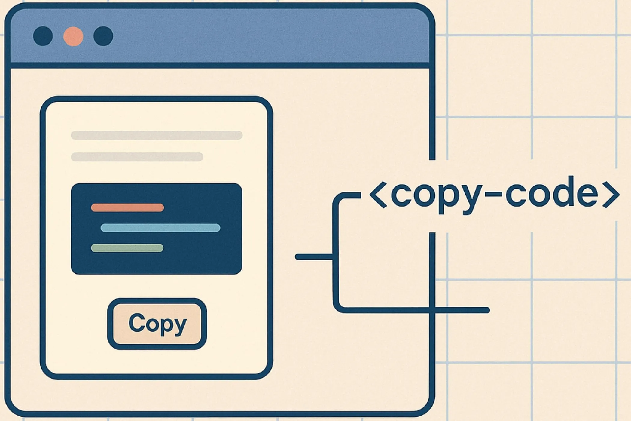
Let’s build a real Custom Element together — something small, useful, and easy to follow.
We’ll create a copy-code component:
- it shows a code snippet,
- adds a “Copy” button,
- copies the text to the clipboard when clicked,
- gives visual feedback,
- works anywhere you drop it.
By the end, you’ll see every concept from the guide come together.
1. Start with a basic class
Every element begins with a class and a definition:
class CopyCode extends HTMLElement {
  constructor() {
    super();
  }
}
customElements.define('copy-code', CopyCode);
Drop this into a page and <copy-code> will render — as an empty element.
2. Add a shadow root
We want encapsulation so outside CSS can’t break our UI:
constructor() {
  super();
  this.attachShadow({ mode: 'open' });
}
Now we have a place to render our component.
3. Render internal HTML and styles
Inside connectedCallback(), we insert the UI:
connectedCallback() {
    this.shadowRoot.innerHTML = `
        <style>
            pre {
                background: #f5f5f5;
                padding: 1rem;
                border-radius: 8px;
                overflow-x: auto;
                margin: 0 0 0.5rem 0;
                font-family: ui-monospace, monospace;
            }
            button {
                background: black;
                color: white;
                border: none;
                padding: 0.5rem 0.75rem;
                border-radius: 6px;
                cursor: pointer;
                font-size: 0.875rem;
            }
        </style>
        <pre><slot></slot></pre>
        <button>Copy</button>
    `;
}- The
<slot>allows pages to pass code into the component. - The
<button>is our action. - Styles stay internal thanks to the shadow root.
4. Add interactivity
Inside connectedCallback(), after rendering:
const button = this.shadowRoot.querySelector('button');
button.addEventListener('click', () => this.copy());
Then define the copy logic:
copy() {
    const text = this.textContent.trim();
    navigator.clipboard.writeText(text);
}
Now <copy-code> actually works.
5. Add feedback (attribute + UI)
Let’s show a quick “Copied!” message.
Inside copy():
button.textContent = 'Copied!';
setTimeout(() => button.textContent = 'Copy', 800);
Simple and friendly.
6. Make it accessible
Our component behaves like a button-triggered action, so we should expose that:
this.setAttribute('role', 'group');We also want the button itself to be keyboard‑accessible.
Fortunately, since it’s a real <button>, the browser already handles:
- keyboard activation,
- focus states,
- ARIA role,
- screen reader announcements.
This keeps your component both modern and accessible.
7. Final code (complete component)
class CopyCode extends HTMLElement {
  constructor() {
    super();
    this.attachShadow({ mode: 'open' });
  }

  connectedCallback() {
    this.shadowRoot.innerHTML = `
      <style>
        pre {
          background: #f5f5f5;
          padding: 1rem;
          border-radius: 8px;
          overflow-x: auto;
          margin: 0 0 0.5rem 0;
          font-family: ui-monospace, monospace;
        }
        button {
          background: black;
          color: white;
          border: none;
          padding: 0.5rem 0.75rem;
          border-radius: 6px;
          cursor: pointer;
          font-size: 0.875rem;
        }
      </style>
      <pre><slot></slot></pre>
      <button>Copy</button>
    `;

    const button = this.shadowRoot.querySelector('button');
    button.addEventListener('click', () => this.copy(button));
  }

  copy(button) {
    const text = this.textContent.trim();
    navigator.clipboard.writeText(text);

    button.textContent = 'Copied!';
    setTimeout(() => button.textContent = 'Copy', 800);
  }
}

customElements.define('copy-code', CopyCode);
8. Usage
<copy-code>
  const total = items.reduce((a, b) => a + b, 0);
</copy-code>
Drop it anywhere and it just works.
This example shows how Custom Elements tie everything together:
- lifecycle
- attributes
- shadow DOM
- slots
- events
- accessibility
In the next section, we’ll explore how to pass data into and out of your components — both with attributes and with properties.
Passing Data and State In and Out
Custom Elements get interesting when pages can actually talk to them. Sometimes that means passing in configuration. Other times it means updating state on the fly. The browser gives you two clean pathways for this: attributes and properties — and they complement each other.
Let’s break the mental model down simply.
Attributes: great for initial configuration
Attributes work best when the page wants to set something once, at creation time.
<my-alert type="warning"></my-alert>Inside your element:
static get observedAttributes() { return ['type']; }
attributeChangedCallback(name, oldValue, newValue) {
    this.updateType(newValue);
}
This pattern keeps HTML declarative and predictable.
Use attributes for:
- types (“warning”, “success”)
- modes (“compact”, “inline”)
- booleans (“disabled”, “open”)
- theme variants
Attributes shine when you want your element to read like a native tag.
Properties: great for dynamic updates
Properties sit directly on the JS instance:
el.value = 42;They’re ideal for:
- numbers
- objects
- arrays
- functions
- anything updated frequently
For example, a chart component shouldn’t pass data through attributes — you set it as a property:
chart.data = [{ label: 'A', value: 10 }, { label: 'B', value: 20 }];When attributes and properties should sync
Sometimes you want both pathways to work:
<my-modal open></my-modal>Or:
modal.open = true;Both should reflect the same state.
You build that reflection yourself:
Property → attribute
set open(value) {
  value ? this.setAttribute('open', '') : this.removeAttribute('open');
}
Attribute → property
attributeChangedCallback(name, oldValue, newValue) {
  if (name === 'open') {
    this._open = newValue !== null;
    this.render();
  }
}
Reflection is not mandatory — only use it when it makes your element easier to understand.
Passing data with slots
Slots aren’t just for text. Pages can pass structured HTML into your component:
<my-tooltip>
    <strong slot="content">This is bold text</strong>
</my-tooltip>
Useful when the content is more than a string.
Passing data with events
Events let your component output state changes naturally:
this.dispatchEvent(new CustomEvent('change', {
  detail: { value: this.value },
  bubbles: true,
  composed: true,
}));
Pages can listen like they would on any native element:
el.addEventListener('change', e => console.log(e.detail.value));A practical rule of thumb
- Attributes for configuration from HTML.
- Properties for data from JavaScript.
- Slots for passing markup.
- Events for sending information back out.
Once you internalize this, Custom Elements feel like regular HTML — just with superpowers.
Debugging Custom Elements
Custom Elements and shadow roots add an extra layer to your component — but DevTools makes debugging them surprisingly smooth once you know where to look.
Here are the tools and tricks you’ll use most often.
Expand shadow roots directly in the Elements panel
In Chrome and Firefox DevTools, shadow DOM nodes appear with a small #shadow-root entry.
Open it and you can inspect:
- your internal markup,
- your internal styles,
- slotted content,
- event listeners.
If you’re using closed shadow roots, you won’t see this — which is one reason most developers stick with mode: 'open' during development.
Use the “Reveal in Elements panel” trick
Right‑click any DOM node (even slotted ones) and choose:
Reveal in Elements panel
DevTools will jump to the correct spot inside the shadow tree.
Check computed styles inside the shadow root
Shadow DOM encapsulation means global styles won’t apply — so when debugging layout issues, check:
- Computed styles (is a reset overriding something?)
- Box model (is a parent clipping it?)
- CSS variables (is the host providing the right values?)
Watch DOM breakpoints on the host
When debugging re‑renders or disappearing content, right‑click the host element and add:
- Subtree modifications, or
- Attribute modifications
This is useful when your component updates itself or when the page around it is changing state.
Log this.shadowRoot often
During development, sprinkle simple logs:
console.log(this.shadowRoot);Seeing the structure helps you catch missing nodes or typos immediately.
Use getRootNode() to see where you are
If you’re unsure whether a node is inside the shadow DOM:
node.getRootNode();If it returns:
document→ light DOM#shadow-root→ shadow DOM
Enable “Show user agent shadow DOM” (optional)
Browsers use Shadow DOM internally (e.g., <input>, <video>). Enabling this in DevTools reveals deep native behavior.
You don’t need this, but it builds intuition.
Debugging events across the boundary
Shadow DOM retargeting can hide the real event target. To debug:
console.log(event.composedPath());This gives you the full propagation path, including inside the shadow tree.
Quick checklist when something feels off
- Is the shadow root attached?
- Are styles in the right place?
- Is your internal HTML actually rendering?
- Is the slot receiving content?
- Are attributes observed?
- Does
composed: trueneed to be set for an event?
Shadow DOM can feel like an extra layer at first, but once you understand DevTools’ entry points, debugging becomes just as fast as working in the light DOM.
Limitations and When Not to Use Custom Elements
Custom Elements are powerful, but they aren’t the right fit for every situation. Knowing where they shine—and where they add unnecessary weight—helps you choose them confidently.
When Custom Elements are useful
Before we look at limitations, remember where they excel:
- reusable widgets you want to drop into any site,
- components that need style isolation,
- small tools like copy buttons, tabs, cards, or media widgets,
- pages that don’t use a larger framework,
- design‑system primitives meant to outlive a single framework.
Now let’s look at the other side.
Not ideal for large, app‑scale reactivity
Custom Elements don’t provide:
- state management,
- diffing,
- templating,
- routing,
- hydration,
- virtual DOM.
For an interactive dashboard or full app, a framework is usually a better fit.
Not ideal when your team is deep into React/Vue/Svelte
Frameworks already have component systems. Introducing Custom Elements may:
- duplicate patterns,
- confuse responsibilities,
- add friction instead of reducing it.
That said, frameworks can consume Custom Elements—but it’s not always seamless.
Styling slotted content has limits
Shadow DOM isolates styles so well that styling slotted content feels restrictive:
::slotted()only targets the top‑level node,- nested children can’t be styled from inside the shadow root,
- advanced selectors don’t work.
If heavy styling control is required across boundaries, this becomes frustrating.
Server‑side rendering is trickier
Custom Elements render in the browser. They don’t SSR by default.
Your HTML will load fine, but:
- no shadow styles
- no internal structure
- no interactive behavior until JavaScript executes.
Some environments (like Web Components‑friendly frameworks or Declarative Shadow DOM) help with this, but it’s not automatic.
Closed shadow roots reduce debuggability
Closed roots protect your API but:
- DevTools can’t inspect internals,
- tests can’t easily target inner elements,
- debugging becomes slower.
Most libraries don’t use closed roots for this reason.
They require thoughtful API design
Native elements have decades of accessibility and API conventions behind them. When you build your own element, you are responsible for:
- semantics,
- keyboard interaction,
- ARIA states,
- focus behavior.
This is not hard—but it does require care.
A simple rule to decide
Use Custom Elements when:
- you want true encapsulation,
- the component is reusable across projects,
- it’s small and self‑contained,
- or you want to escape framework lock‑in.
Avoid them when:
- you’re building an entire application,
- your team already lives in a framework ecosystem,
- you need deep SSR,
- or styling must remain fully global.
Now let’s look at real places Custom Elements shine.
Real‑World Use Cases
Custom Elements shine the most in the small‑to‑medium UI pieces that appear across many pages or many projects. They let you package logic, markup, and styles into one predictable element that works everywhere.
Here are the kinds of components where Custom Elements feel like a perfect fit.
1. Small reusable widgets
These are the everyday building blocks of modern sites:
- copy‑to‑clipboard buttons
- expandable sections
- tabs
- toggles and switches
- modals and drawers
- tooltips
- rating stars
All of these need:
- predictable markup,
- isolated styles,
- a few event listeners.
They’re too small to justify a whole framework but too repetitive to rebuild on every site. Custom Elements hit the sweet spot.
2. Embeddable components for multiple websites
If you’re creating something intended to run on other people’s sites, Custom Elements give you:
- style isolation by default,
- a stable API surface,
- protection from global CSS collisions.
Great fits include:
- newsletter signup widgets,
- donation buttons,
- review cards,
- video or audio players,
- code or image viewers.
This is exactly what the Shadow DOM was built for.
3. Design system primitives
If your team wants consistent UI across several apps or sites, Custom Elements can serve as low‑level building blocks:
<ui-button><ui-input><ui-card><ui-icon>
They won’t replace your framework, but they work well as the “atoms” that everything else is built on.
4. Site‑specific utilities
Sometimes you just want a small helper that you can sprinkle around your site without worrying about CSS or JS conflicts:
- formatting timestamps,
- rendering charts from inline JSON,
- wrapping long code blocks with scroll/overflow logic,
- lazy‑loading media.
These don’t need the overhead of React or Vue; a single Custom Element is more than enough.
5. Tools that belong directly in HTML
Elements that feel like native tags:
<image-compressor><qr-generator><json-viewer><copy-code>
They look at home next to <video> or <details> — and that’s part of the appeal. They read cleanly in HTML, behave predictably, and don’t leak styles.
When NOT to use Custom Elements for use cases
- Large dashboards with complex reactivity
- Apps that need routing, hydration, or SSR
- Highly coupled components where global styling is desired
If you need an app framework, you’ll feel the limitations quickly.
A simple rule
Use Custom Elements when you want reusable, isolated UI that behaves like a small native component.
With real-world cases covered, let’s wrap things up and solidify a mental model for building browser-native components.
Final Thoughts
Custom Elements aren’t just another way to write JavaScript—they’re a reminder that the browser already has a component system built into it. A simple one. A predictable one. And for many tasks, a surprisingly powerful one.
After working through this guide, you’ve seen the pieces that make it feel natural:
- a lifecycle that mirrors what frameworks offer,
- attributes and properties that let pages configure components cleanly,
- the Shadow DOM for structure, styles, and safety,
- slots for controlled flexibility,
- events for communication,
- accessibility patterns that match native elements,
- and DevTools support that makes debugging approachable.
If there’s one idea to carry forward, it’s this:
A Custom Element should behave like something the browser could have shipped.
Readable in HTML. Predictable in behavior. Stable across pages. Easy to compose. Hard to break.